The Journey of Mankind is a simple timeline & world map that illustrates the spread of modern humans out of Africa; it’s amazing to me how much detail we know about this process, down to the catastrophic effects of the explosion of Mt. Toba.
The New York Times reliably has good data visualization graphics. Two examples: “An Accounting of Daily Gun Deaths“, by Bill Marsh, and an interactive (Google Maps based) homicide map of the five boroughs.
Juice Analytics has a treemap-based visualization of the US federal government’s stimulus package.
A German energy company is promoting recycling with a clever spam visualization tool. Send them your spam email and watch them recycle it into something beautiful. Or at least something else.
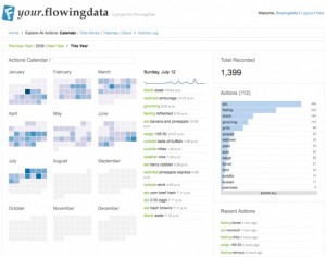
Niel Bornstein turned me onto Nathan Yau’s Flowing Data (above), which uses Twitter to log information that can then be analyzed and presented in a variety of ways. I’m experimenting with it now.
Good Data has an interesting, and free, analytical service for Amazon’s Cloudfront content delivery network with canned reports; presumably this can be extended to other cloud services.
Similarly, Widgenie provides tools for visualization for all kinds of data.

