#IMWeekly: October 7, 2013

Iran
Iranian president Hassan Rouhani chatted about Internet censorship with Twitter founder Jack Dorsey last week. The medium for their conversation? Twitter itself, which is blocked in Iran. Dorsey launched the conversation by asking Rouhani if Iranian citizens were able to read his tweets. Rouhani responded by claiming that he intends to “ensure my ppl’ll comfortably b able 2 access all info globally as is their #right,” potentially signaling a move toward greater Internet freedom in the country.

Russia
According to documents collected by Russian journalists Andrei Soldatov and Irina Borogan, Russia plans to monitor both the phone and Internet communications of Olympic competitors and spectators in February.

Vietnam
Dissident blogger Le Quoc Quan was sentenced to 30 months in prison and a $59,000 fine last Wednesday. Quan was arrested last December after criticizing the role of the Communist Party in Vietnam’s leadership; he was charged with tax evasion.

#imweekly is a regular round-up of news about Internet content controls and activity around the world. To subscribe via RSS, click here.

Map-Based Data Visualizations Reveal Patterns in Human Behavior

Billions of tweets. Millions of check-ins. How can we make sense out of such staggering amounts of data? One answer: Maps.

Social media companies and researchers use map-based visualizations to link virtual information with the physical world, surfacing patterns of human behavior that dazzle and educate.

Twitter’s data science team recently visualized all geotagged tweets in two and three dimensions. Both reveal where tweets concentrate, two-dimensional geography maps through color and three-dimensional topography graphics through peaks and valleys.

Spikes of tweets tower over New York.

Spikes of tweets tower over New York. Screenshot from Twitter blog. (Click image to see original.)

Foursquare created a zoomable map of 500 million check-ins and time-lapse videos of check-in data from New York and Tokyo. For the introspective or quantified selfers, a company called Etch will create a personalized map of individual Foursquare users’ check-ins.

Yelp used keywords from reviews on its site to visualize restaurant types in various cities. (For patio dining in Boston, head to Harvard Square or the Back Bay and prepare to run into hipsters.)

This visualization technique extends beyond real-time social media data. The New York Times mapped user suggestions of quiet spaces in the city. The Guardian displayed an interactive map of global protests that occurred this year. Last year, University of Illinois researcher Kalev Leetaru mapped the sentiment of Wikipedia articles to show emotions around history over the past two centuries.

A map of global protests in 2013.

Global protests in 2013. Map by John Beieler and Josh Stevens, screenshot from The Guardian. (Click image to see post.)

In his book Rewire: Digital Cosmopolitans in the Age of Connection, Ethan Zuckerman compares infrastructure maps, which show what’s possible, to flow maps, which show what occurs. Unsurprisingly, most of the data shown on these maps hews closely to physical borders and man-made developments such as roads. But these maps also reveal the contours of behavior: where people like to announce their presence or grab a bite to eat.

Such maps can help us better understand cities, society, and human behavior, said Visualizing.org founder Adam Bly in a 2011 South by Southwest Interactive presentation. Comparisons of where tourists and locals snap photos help urban planners, business owners, or local chambers of commerce interested in economic development. Mapping fast food and healthy food locations offers insight to public health officials, teachers, and policy makers who want to ensure access to nutritious food. Analyzing mobile phone data and realizing that human movement is 93 percent predictable influences where public transportation or energy grids should go.

Visualization of photos taken in Boston

Visualization of photos taken by locals (blue) tourists (red) and both (yellow) in Boston. Eric Fischer/Flickr, CC BY-SA 2.0

As cheap data storage abounds and visualization tools proliferate, maps offer a window into how humans live, in addition to guidance on how to get around.

Citizen Sensing and Crisis Informatics: Twitter and Disaster Response

In a piece published in May in Smithsonian, “The World According to Twitter, in Maps,” Twitter use in the Western hemisphere was compared to electrification and lighting use. Studies reveal remarkably similar rates, such that a map illuminated by tweets looks very much like a satellite image of artificial light use. It seems ambitious to suggest Twitter will become as ubiquitous as light, but the findings are nonetheless illuminating. Growing global Internet saturation and increasing Twitter usage might tell us a great deal about the relationship of humans and technology, but how might Twitter analysis shed light on our relationships with each other and the environment?

Since it started as a platform designed for cell phone use in 2006, Twitter has had an arguably resounding presence in the world. An estimated 554 million registered users send about 9,000 tweets per second and produce 58 million tweets each day on average. In people’s everyday lives and at the level of national and regional politics in places like Egypt and Turkey, the microblogging service is redefining relationships, invigorating information sharing, and shifting power structures, both online and offline.

The vast number of tweets and other user-generated bits of content online has prompted new approaches to data analysis, including “data philanthropy,” which claims to use big data to mitigate crisis and potentially avert social, financial and environmental disasters. In April, the Skoll World Forum brought together world experts on Big Data and its application, including the  president of  non-profit technology company Benetech, who explained:

Massive amounts of data are collected on the pollution in our cities and the changes in our climate. The more we use technology in our education and health systems, the more data we collect about how people learn and what keeps us healthy or makes us sick. These information-centric areas are built for Big Data – data that if better understood could help provide a pathway to maximize our human potential, instead of maximizing profits.

More than just a microblogging service on the Internet, Twitter is a platform for peer-to-peer education, a tool for real-time technology-mediated learning, and a potential gold mine for citizen sensing, which engages citizens as sensors in generating geo-referenced information. Twitter’s open API feature means that tweets are downloadable as raw data. This enables Twitter mapping – a form of research that turns topical tags and tweets into spaciotemporal nuggets that researchers analyze and apply toward myriads of social, political, and environmental situations, including humanitarian responses to natural disasters. Researchers at the Institute of Environment and Sustainability claim ever-growing access to broadband connections and enthusiastic adoption of social media has created “the potential of up to 6 billion human sensors to monitor the state of the environment, validate global models with local knowledge, contribute to crisis situations awareness and provide information that only humans can capture.” Human-machine relationships mediated through sites like Twitter offer optimal conditions for rapid dissemination of useful information, collective thought, and social action.

Crisis Informatics is a research field that combines targeted information extraction and information management with coordination efforts and sensemaking processes. It emerged from collaboration among social media, emergency responders, and computer sciences. In the case of a disaster, such as a flood or tornado, crisis informatics provide knowledge about similar past disasters and response strategies. The clearinghouse of prior knowledge helps first responders predict and manage events as they unfold. Additionally, crisis informatics offers details about the extent of damage and number of fatalities, which enables more focused and efficient emergency medical responses. Mapping projects like GDELT and tools like Twitris enable real-time monitoring and multi-faceted analysis across space, time, populations, networks, emotions, and sentiment. Numbers and locations are important, but data may reveal more than numbers.

Along these lines, recent analysis of more than 2 million “disaster tweets” related to the May 2013 Oklahoma tornado presents an interesting case study. As Patrick Meier of iREvolution details in his blogpost “Analyzing 2 Million Disaster Tweets for Oklahoma Tornado,” research conducted by Hemant Purohit and colleagues at the Qatar Computing Research Institute further blurs the lines between computer science, social science, and humanitarian work. Purohit and his colleagues found 7% of tweets in the first 48 hours after the tornado were related to helping meet people’s immediate survival needs- donation of water, food, and clothing. Certainly, such findings reveal Twitter users’ humanitarian intentions, but they do not reveal whether the people in need actually received the supplies and services or how they fared beyond the initial 48 hours. How the individuals and communities affected by the tornado are doing today are questions for further ethnographic study that would compliment the rich statistical analysis we have and dig deeper into the relationship of Internet and society.

Learn more about Twitter analysis in a study just released by QCRT that looks at the confluence of crisis mapping, citizen sensing, and social media through the lens of citizens’ roles in coordinating crisis response.

Twitter’s Geography: Visualized and Explained

Twitter’s CEO Dick Costolo has called the popular microblogging service “the pulse of the planet.” With a little less than eight percent of the world’s population on Twitter, that pulse has room to grow. Nevertheless, recent big data research into the geography of the Twittersphere sheds light on where users tweet, with whom they tweet, and what information they share. The findings illustrate that Twitter helps people transcend geographic boundaries that restricted communication in a pre-digital age.

A research team from the University of Illinois at Urbana-Champaign examined location data from the Twitter Decahose, which includes 10 percent of tweets sent on a given day. The team examined more than 1.5 billion tweets sent from more than 71 million unique users over 39 days and documented its findings in a paper published online.

Extracting Location from Tweets
Twitter displays the long-tail phenomenon of user participation: 85 percent of tweets come from the top 15 percent of users, and one-fifth of tweets come from just one percent of users. Only 3 percent of tweets are georeferenced, meaning their metadata includes location information. Echoing the long-tail, two-thirds of georeferenced tweets come from one percent of users, representing a small subset of Twitter users.

Researchers dramatically expanded the number of located tweets through geocoding. They analyzed information from user-generated Location and Profile fields and inferred location for more than one-third of tweets from the Decahose. These fields remain fairly static as a user tweets, so future researchers may be better off geocoding users rather than tweets. This could simplify location-based Twitter research by reducing the number of data points to analyze, saving time and computing power.

Though Twitter users communicate in a variety of languages (the most multilingual areas being Hungary, Serbia, Lebanon, Israel, and the West Bank), they tend to provide their location data in English.

Where Do People Tweet From?
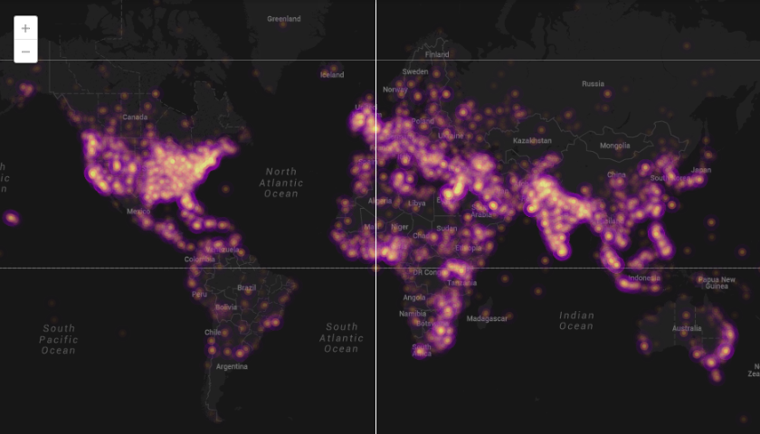
Where electricity exists. The map below overlays georeferenced tweets with NASA Earth’s City Lights images. Red dots represent georeferenced tweets, blue dots represent access to electricity, and white dots represent an equal balance of tweets and electricity.

A map shows strong correlation between Twitter use and electricity accessibility.

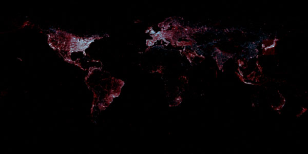
Red dots represent georeferenced tweets, blue dots represent areas with electricity, and white dots represent both. Image via First Monday/Leetaru, et al. Click image for high-resolution version.

The map reminds us that accessibility to digital tools still relies on accessibility to tangible infrastructure, though the proclivity of red illustrates that people tweet even when electricity is scarce. (The box around Japan reflects some tweets from boats but is also the relic of old third-party Twitter clients that “handled the country’s polygonal shape a bit oddly,” Leetaru explained in an email).

Most georeferenced Twitter users joined in 2010 (shown in green on the map below), with concentrations of European, Middle Eastern, and Southeast Asian users joining in 2011 (shown in blue on the map below).

A map shows the year when Twitter users joined the service.

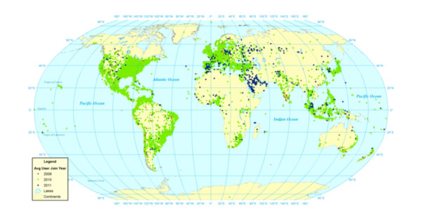
Green dots represent georeferenced users who joined Twitter in 2010 and blue dots represent georeferenced users who joined in 2011. Image via First Monday/Leetaru, et al. Click image for high-resolution version.

Who Do People Communicate With on Twitter?

People on Twitter retweet and reference close-by and far-away users at almost equal rates. A map of geocoded retweets reveals patterns among continental communication. The researchers write:

“Latin America is more closely connected to Europe than to the United States, while Asia connects more closely to the U.S. and the Middle East connects to both the U.S. and Europe. The east coast of the United States is a clear nexus point for the country, through Europe appears to be more dominant than the United States in producing content retweeted by the rest of the world.”

A map showing the location connections between retweets.

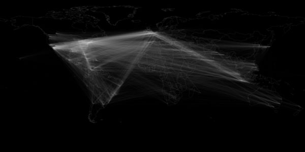
This map shows the location connections between users who retweet other users. Image via First Monday/Leetaru, et al. Click image for high-resolution version.

Research from 2012 showed Twitter users tended to follow people geographically close to them and those located in areas easily accessible by flight. That paper examined pairs of followers, but the University of Illinois team maintains that retweets and references to other users are better indicators than followers of how much a user pays attention to another user’s tweets.

What Do People Share on Twitter?
Mostly social media. More than half of all links in tweets go to six domains: Twitter, Instagram, Facebook, YouTube, ask.fm, and Tumblr. Only 7.8 percent of all links people share on Twitter reference English mainstream news. The most popular sources for English-language news on Twitter include the BBC, Huffington Post, New York Times, and Guardian.

People link to articles about close-by and far-away news at almost equal rates. The map below compares regional references on Twitter and in Google News’ RSS feed. Blue dots represent more georeferenced Twitter coverage, red dots represent more mainstream media coverage, and white dots represent equal coverage.

This map compares Twitter and mainstream media coverage of areas around the world.

The blue dots represent Twitter coverage of an area and the red dots represent mainstream media coverage of an area. Image via First Monday/Leetaru, et al. Click image for high-resolution version.

Twitter appears to cover more information on Latin America and Eastern Europe, while mainstream media covers Africa, South Asia, and East Asia more thoroughly.

The most influential users, based on Klout score, concentrate in Malaysia, Indonesia, France, Spain, the U.K., the U.S. and Venezuela. The least influential, meaning those whose content is least likely to spread around the Web, reside in Eastern Europe, the Middle East (especially Turkey), India, and Southeast Asia.

Want to see more Twitter visualizations? The company crunches its own data and posts visualizations on its Flickr page.

Social Network Alternatives

Courtesy of AJ Cann/Flickr

In May 2013, Facebook announced that it had 1.1 billion users, 665 million of which were active on the site each day. The three major global social networks (Facebook, Google+, and Twitter) have all experienced huge growth in the last few years. According to the GlobalWebIndex, of the global Internet population approximately 51% use Facebook on a monthly basis, 25% use Google+, and 21% use Twitter. Despite the rapid growth of these social networks, many users have become dissatisfied with their business models, political practices, constantly changing posting policies, and undemocratic forms of governance. Aside from the concerns over PRISM, Facebook has recently drawn attention for its blocking pictures of breastfeeding mothers or the company’s handling of rape joke memes spreading through their network. Activists and political dissidents in particular have found these social media sites stifling and sometimes dangerous, but often find themselves with few alternatives to spread their messages online.

As a result, several interesting social media alternatives have recently been created to address these concerns and protect both privacy and dissent online. While many social network projects have launched over the past few years, few alternatives remain in active development. Below is a curated list of the best current alternatives for people with moderate computers skills concerned with privacy, control of their information, and networking outside the control of governments or corporations.

Diaspora: This nonprofit, user-owned, social network consists of a group of independently owned “pods” that interoperate to form the network. Since its launch in 2010 by four students at New York University’s Courant Institute of Mathematical Sciences, Diaspora has been one of the most popular alternative social media sites. As of June 2013, Diaspora reports it has 405,551 registered accounts (which includes users on the main pod and connected people from other pods) and 2,270,599 estimated users on the most popular pod (estimated because that information is not public) participating in this distributed social network. Diaspora allows for pseudonyms, ensures users own their content, and because the network is distributed by other users who install the freeware and setup web servers, the network cannot easily be disrupted or its users surveilled.

App.net: In July 2012, this platform evolved beyond being a place for developers to showcase new apps and became a full-fledged social network. The design of App.net is fairly similar to Twitter, but with one big difference. Instead of selling user data to advertisers, the site requires users and developers to pay subscription fees for premium accounts ($5 monthly, $36 yearly, or $100 a year for developers). There are no ads on App.net, but more importantly for social activists and people concerned with controlling their data, App.net will only share information with third party vendors the service needs to work (like payment processors for accounts) and law enforcement (if proper legal channels are observed). When a user deletes something from App.net, the company makes sure it’s gone from their servers within two weeks. It’s not a completely private social network, but it’s close.

Tent.io: This Twitter-like (but not Twitter-clone) alternative offers many of the same advantages App.net boasts, but rests on an entirely different method for distributing information. Tent is an open Internet protocol, like email or TCP/IP, that can be used to run a Tent server (via Tent.is) or connect several social networks together. Tent.is offers users the ability to run their own server, lets them share anything, and is designed to help users migrate from other social medias. Tent can also be run as a Tor hidden service, which can allow activists to communicate without being traced, and because Tent is decentralized, it cannot be blocked the same way Twitter has been in several countries. Tent also touts itself as a better alternative even to email since users can change their address and the followers come with them. Tent also argues it fosters innovation since applications can be developed for Tent without needing to ask for permission from the protocol’s owners. The Tent protocol can be used with Tent.is or be used independently to grow other networks. Tent is a bit more technical than the other alternatives featured here, but its flexibility and expandability mean it’s likely to continue developing.

GlassBoard: Featuring a very simple and comprehensive privacy policy, GlassBoard is probably the easiest to use of the alternative social networks featured here. GlassBoard’s innovation in social networking is to make money by charging a small user fee rather than sell information to advertisers. Perhaps because they know many people have indicated they would not pay for access to a social network, even if it meant more control over their information, GlassBoard does offer a free account with some limitations, and premium accounts with more storage or access to APIs. GlassBoard also offers iPhone and Android apps, all user data is encrypted on GlassBoard’s servers, and they won’t sell your personal information for targeting ads. GlassBoard does not have privacy settings. Instead, everything a user does on the service is private and can only be seen by people they approve. While GlassBoard primarily focuses on providing businesses with a private communications network, anyone willing to have some storage limitations or pay a bit for a premium account can enjoy a very simple, secure, and mobile social network.

Identi.ca: Identi.ca is another micro-blogging service similar to Twitter, but offers many features Twitter does not such as XMPP support and the ability to freely export personal and “friend” data. Identi.ca enjoyed early success when more than 8,000 people registered for the service within the first 24 hours of its public launch in July 2008. For those concerned with controlling their information, Identi.ca will publish all posts under the Creative Commons Attribution 3.0 license by default, but paying customers have to option to choose a different license. In June 2013, Identi.ca began migrating to the pump.io software platform in order to offer more features, and its development is likely to continue. Setting up the free and open source software on a server requires a bit more technical skill than most of the other alternatives presented here, and joining might be delayed until the migration to pump.io finishes, but this open source social network is worth watching.

For those not ready to completely abandon Facebook, Twitter, or Google+ there are still a few options for managing how user data is used. Two good browswer add-ons for determining exactly where your data is going are Collusion for Mozilla Firefox and PrivacyScore for Google Chrome.  To keep Facebook, Google, and Twitter from tracking you (and to speed up your browser), the Disconnect extension works well with Firefox, Chrome, and Safari. Finally, to opt out of other advertising that tracks users, the Network Advertising Initiative’s website will show who is tracking a user’s browser and how to disable it.