Originally posted to the MBTA Customer Technology Medium blog
MBTA.com is getting better. It’s getting better because we learn from you.
Today, the agency’s website attracts 1.6 million monthly active users, and both usage and satisfaction metrics are trending upwards. Over the last year, we’ve increased our NPS score by 26%. We were named a 2019 Webby Honoree in the Government & Civil Innovation website category. And Tim Buckley, communication director for Governor Baker says,
“The MBTA’s Customer Technology team produces dynamic web content and tools that not only help customers use the T, but also helps riders and the public understand how the T is putting their money to use every day. The T’s team is among the best in state government when it comes to their ability to adapt and produce useful content on this scale.”
In late 2017, the Customer Technology team released a new version of the website based on more sophisticated technology. But we didn’t stop there. We collected surveys, looked at analytics, and talked to riders. In other words, we took a customer-centric approach to learn what was working and what needed changing.
Based on this research, we learned that:
You want to know when to catch your bus or train.
The website is powered by some really complex real-time data about the system and the service. And this information fuels the vast majority of visits to the site. Google Analytics tells us that 77% of visitors to mbta.com click through to a schedule page or a stops page. And many of these folks are returning users who want to know when to expect the next train or bus.
With tools like FullStory, we could see that many of you were clicking on the departures tab of the stops pages, so we moved that information to the forefront and updated stops pages to highlight real-time information about your next trip. We also added information about nearby transfer points and links to get directions or a street view so you can see what the stop looks like.
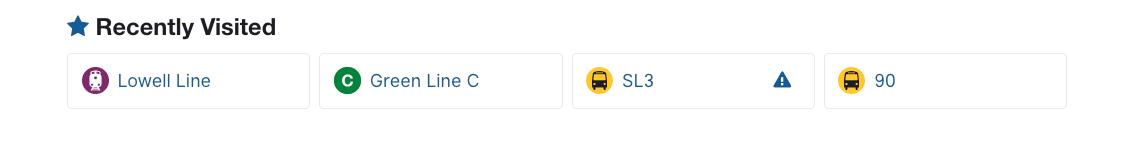
And to help you find your schedules faster, we introduced shortcuts on landing pages based on your previous visits to our site. Today, these shortcuts receive over 1 million clicks per month.
You visit the commuter rail timetable a lot. I mean, like A LOT.
80% of all visits to our schedule pages are for the commuter rail. And 85% of your commuter rail questions to customer support are about the timetable. Before we made any changes to these pages, we wanted to be sure we heard from you about what you need. So we took a trip to South Station to talk with you.
You showed us how you use our timetables on your phone, and shared your ideas on how we could make them better. Then, we showed you design prototypes and asked more questions.
We used your feedback to redesign these pages — adding flag stops and early departure information. And because Bostonians believe in sustainable mobility, we added a bicycle icon so you’ll know when you’re allowed to bring your bike on the train.
You need to know how much your trip is going to cost.
Boston has one of the most complex fare systems in the nation. To help make it more clear, we researched over 1300 survey responses to better understand your most frequently asked questions. Then we redesigned the fares overview page and restructured the way we talk about fares across the site.
You want to learn how the system works.
Five thousand of you visit Trip Planner nearly every day. When you start a new job with a new commute or come to Boston as a new student, you want to understand the public transit options near you. That’s why we added an interactive map and more filter options to Trip Planner. We also revamped Transit Near Me to include a map with stops nearby and a list of scheduled train and bus departures leaving shortly.

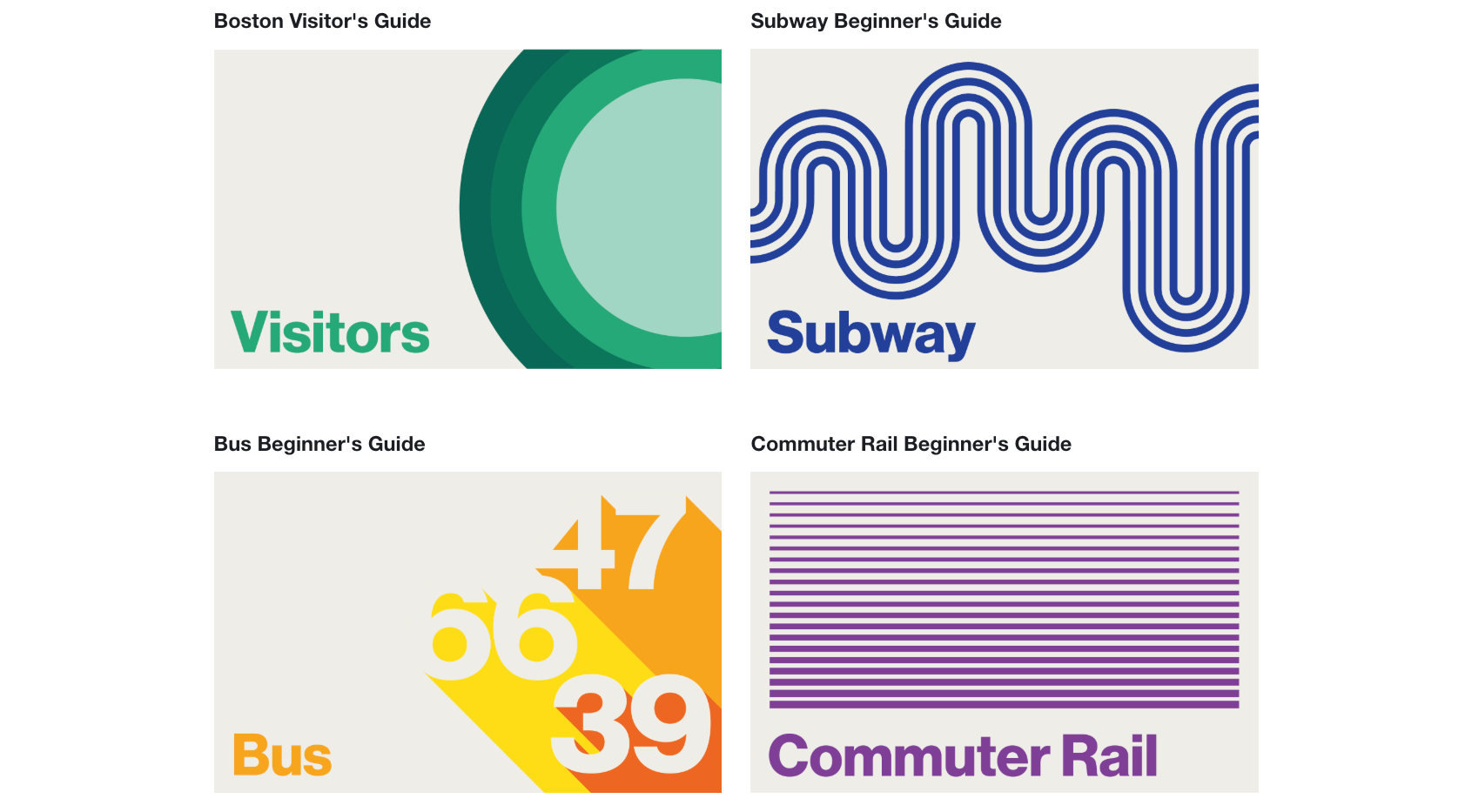
You’ll also find a suite of User Guides to help you learn more about the MBTA. Guides receive over 50 thousand pageviews a month. If you’ve never taken the bus, want to attend a parade, or just plan ahead for your winter commute, these guides provide more in-depth information.
You want to find out why your commute was messed up.
We hate being late for work too, and it helps to understand exactly what’s happening. But it took a lot of clicks to find details about an alert — and it was hard to know when something was immediately important. After this change, clicks on alerts decreased by 46% — because the information you need is available at a glance, you don’t need to click through for more details.
To better inform you about transit news, projects, and diversions, we redesigned the homepage using both analytics and heatmaps from FullStory to tell us what you found most valuable. And we introduced a content tagging system used throughout the site to automatically surface the most relevant and fresh information to you.
Last month, we made updates to the capital projects index page where you can find a list of all system improvements and construction projects. We added filter and search functions so it’s easier for you to find out about work that might impact your trips on the T.
You want accessible tools for everyone.
We collaborated with the Institute for Human Centered Design and our friends in System-Wide Accessibility to test our website with screen readers and improve usability for everyone. This isn’t an exhaustive list, but these are some accessibility techniques we apply with every new feature we touch:
- Use clear and simple language
- Ensure that text and background colors have sufficient contrast for legibility
- Use relative font sizing to improve visibility on different devices
- Avoid images to display text or unnecessary animations
- Never convey information with color alone to emphasize or highlight text
- Create proper headings and a logical tab order allowing screen-readers to easily bypass information
- Ensure all images have alt text to convey equivalent information
- Simplify table structures and avoiding complicated nesting
- Use ARIA attributes to supplement HTML strategically so a variety of screen readers can properly interpret different elements
- Use native HTML elements because they give you focus, keyboard support, and built-in semantics
You expect us to be accountable.
The MBTA website is YOURS. It’s available open-source, which means you can look at the code and understand where the information on the site comes from, help us find bugs, or even contribute a fix yourself. By allowing anyone who’s interested to suggest changes to the source code, the website will be more useful and error-free over the long term.

We’ve accomplished a lot since 2017, but user analytics and customer feedback still show that some important sections of the website continue to frustrate riders, making it a challenge for you to get the information you need. But your fellow Bostonians in Customer Technology are on it.
Coming up, here are some of the website changes you can expect to see:
- Schedule page updates focused on route variants, directionality, and stops for improved clarity, ease of use, and accessibility
- Improvements to the “Contact Us” page so we can be more responsive to customer questions and issues reported from the website
- Menu navigation improvements, particularly targeting mobile devices
- Improved fare finder tools to help you more easily calculate the cost of your trip
- Better shuttle communications (when they are happening and where they are)
- More stories about MBTA projects and their impact on your commute
We look forward to continuing to make small changes that add up over time and help all of us navigate our transit system and enjoy our city.
Recent Comments