Negative results
I’ve often complained to my colleagues that we pay far too little attention to negative results. Negative results from our data don’t tell us as much as positive results, but that hardly means that we learn nothing from them. At the very least, we can learn what directions have not worked out in a research program and what efforts not to repeat.
Thus, the following from over at Crooked Timber caught my eye this morning:
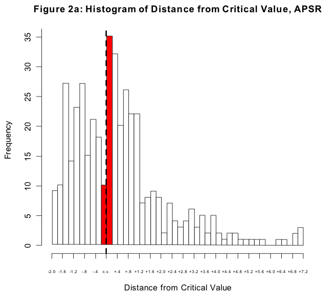
Now, if you write a paper describing negative results—a model where nothing is significant—then you may have a hard time getting it published. In the absence of some specific controversy, negative results are boring. For the same reason, though, if your results just barely cross the threshold of conventional significance, they may stand a disproportionately better chance of getting published than an otherwise quite similar paper where the results just failed to make the threshold. And this is what the graph above shows, for papers published in the American Political Science Review. It’s a histogram of p-values for coefficients in regressions reported in the journal. The dashed line is the conventional threshold for significance. The tall red bar to the right of the dashed line is the number of coefficients that just made it over the threshold, while the short red bar is the number of coefficients that just failed to do so. If there were no bias in the publication process, the shape of the histogram would approximate the right-hand side of a bell curve. The gap between the big and the small red bars is a consequence of two things: the unwillingness of journals to report negative results, and the efforts of authors to search for (and write up) results that cross the conventional threshold.
Technorati Tags: academia, philosophy, social science

 Ecto blogging software