

The following chart portraying the Philippine Corruption Rank on Trading Economics has been making rounds on social media in recent times. 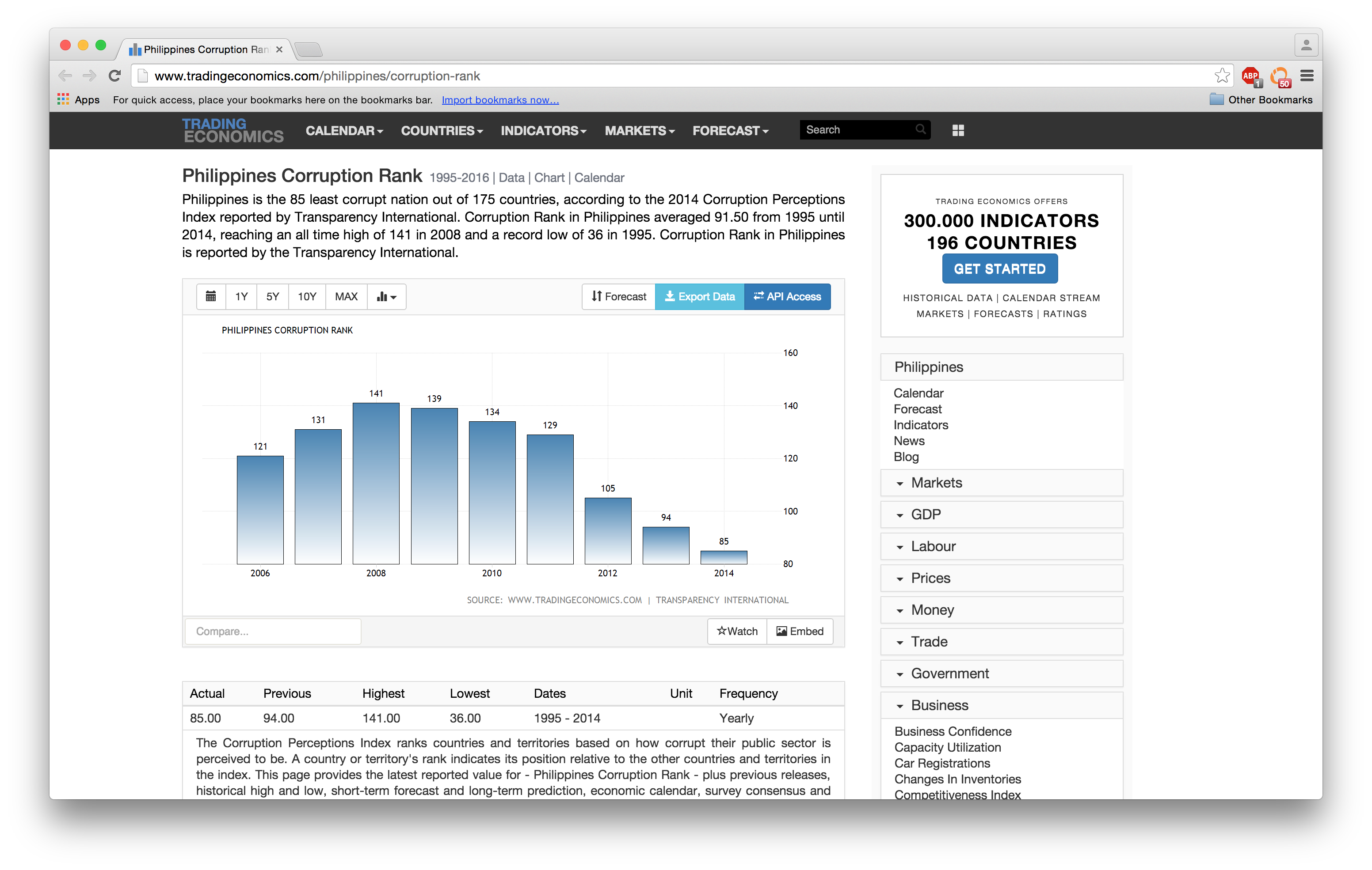 This is perhaps due in part to the upcoming Philippine general elections in May.
While it is indeed great that the Philippines is climbing up the ranks of least-corrupt countries and territories, visually, however, the chart and description in the site are rather misleading, due to lack of information. Lack of information, or as Stanford professor James D. Fearon posits in Rationalist Explanations for War, the combination of private information and incentives to misrepresent, can often lead rational states to war.
He writes,
The mainstream international relations literature recognizes the existence of both private information and incentives to misrepresent, but typically views them as background conditions to be taken for granted rather than as key elements of an explanation of how rationally led states might end up at war.
— Fearon, J. (1995). Rationalist explanations for war. International Organization, 49(03), p.379.
But I digress. One might argue that the baseline of the chart above is actually correct as it is cropped where 80 is used as the baseline. While true, at first glance, most people won’t notice the baseline and will immediately consider the height of the columns. Resolved, there are more outstanding items that need to be considered:
First, when Transparency International does its annual surveys of sentiments on corruption or the Corruption Perceptions Index (CPI), the total countries in the rankings vary per year. This means that a rank of 25 in 1996 isn’t similar to a rank 25 in 2003. Thus, a direct comparison just doesn’t work.
Second, countries are often tied in the rankings. For instance, in 2010, the Philippines was ranked 134 together with Azerbaijan, Bangladesh, Honduras, Nigeria, Sierra Leone, Togo, Ukraine and Zimbabwe. This needs to be demonstrated.
Third, Transparency International was founded in 1993, and started collecting data and publishing the CPI in 1995. The default view giving an overview of all the data available might give us a more complete picture.
I thus propose the following views instead to represent the data available and provided: 
Red bars are the total number of countries in the ranking for that year, and the bottom edge of the ranking. The blue bars are the ranks of the Philippines for that particular year. Each column must be read separately as the totals are not equal.
Since we need to see how each year compares relative to the other based on equal footing, the following chart is generated. We are able to do this by using percentiles and percentile differences:
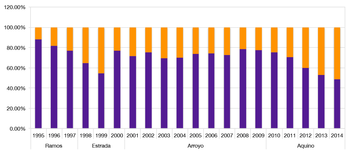
This chart can be treated and read as one whole, where patterns may be derived. The violet section of each column indicates the percentile in which the Philippines is in for that year. The tangerine section indicates the percentile difference versus the totals. Thus, the lower the percentile (ie. bigger tangerine section, smaller violet section), the better for the Philippines.
Note that while the Ramos, Estrada and Arroyo administrations ended in 1998, 2001 and 2010 respectively, I am attributing these years to the succeeding administration as the CPI is published in December of that year, 6 months after the president-elect takes office in June of those years.
For everyone’s reference, here is the data table derived from the annual CPI reports:
| President | Year | Rank | Total | Difference | Percentile | % Not Corrupt |
| Ramos | 1995 | 36 | 41 | 5 | 87.80% | 12.20% |
| 1996 | 44 | 54 | 10 | 81.48% | 18.52% | |
| 1997 | 40 | 52 | 12 | 76.92% | 23.08% | |
| Estrada | 1998 | 55 | 85 | 30 | 64.71% | 35.29% |
| 1999 | 54 | 99 | 45 | 54.55% | 45.45% | |
| 2000 | 69 | 90 | 21 | 76.67% | 23.33% | |
| Arroyo | 2001 | 65 | 91 | 26 | 71.43% | 28.57% |
| 2002 | 77 | 102 | 25 | 75.49% | 24.51% | |
| 2003 | 92 | 133 | 41 | 69.17% | 30.83% | |
| 2004 | 102 | 146 | 44 | 69.86% | 30.14% | |
| 2005 | 117 | 159 | 42 | 73.58% | 26.42% | |
| 2006 | 121 | 163 | 42 | 74.23% | 25.77% | |
| 2007 | 131 | 180 | 49 | 72.78% | 27.22% | |
| 2008 | 141 | 180 | 39 | 78.33% | 21.67% | |
| 2009 | 139 | 180 | 41 | 77.22% | 22.78% | |
| Aquino | 2010 | 134 | 178 | 44 | 75.28% | 24.72% |
| 2011 | 129 | 183 | 54 | 70.49% | 29.51% | |
| 2012 | 105 | 176 | 71 | 59.66% | 40.34% | |
| 2013 | 94 | 177 | 83 | 53.11% | 46.89% | |
| 2014 | 85 | 175 | 90 | 48.57% | 51.43% |
Insights and analysis can definitely be derived from all of the above and I’ll leave that to the readers and audience to do.
This post is far from perfect and can become even better by being able to provide the facility to drill down into the details and making it interactive. Perhaps that can happen in the near future.
For now, I leave you with this video:
Here’s to an even better Philippines. 🙂
For detailed information on the CPI, please check out their FAQ.
Sources: Corruption Perceptions Index, Transparency International
![]() This work is licensed under a Creative Commons Attribution 4.0 International License.
This work is licensed under a Creative Commons Attribution 4.0 International License.