Signs of life: what we see in cities
I recently finished reading the catalogue by Grant Arnold and Michael Turner for the Vancouver Art Gallery‘s current exhibition, Fed Herzog – Vancouver Photographs. Herzog, who was born in Stuttgart, came to Vancouver (via Toronto) in 1953. Orphaned in the forties, and a survivor of Stuttgart’s Allied bombing raids, he was 23 years old when he landed in Vancouver. I picture Herzog as a guy with nothing much to lose at this point, young, with a motorcycle, a job, a camera, a bit of an adventurer (he picked Vancouver as a destination because it came up in an appealing, robust sort of way in one of his German high school textbooks). He started taking colour photographs of the city, focusing not on arty or landscape-y aspects, but on how its built form determined (and was determined by) its inhabitants.
In a chapter he titles “Fred and Ethel” (pp.135-149), Michael Turner writes,
Early in this essay I quoted Herzog on the changes to Granville Mall, its transformation from a Theatre Row to ‘an East German slum.’ In the early 1970s city council decided that neon was tacky, that it made the city look cheap, unsophisticated. Ordinances were enacted to put limits on the kinds of signage businesses could use. Restrictions on neon became part of this. In its place, businesses were encouraged to use awnings as signage, creating a brutal and claustrophobic tunnelling effect. More commonly, though, businesses used rear-lit plastic signs, which more often than not sat flat against the building’s face, resulting in the elimination of the surtitle effect one experienced when walking down operatic streets like Granville, Hastings and Robson. Of course, another consequence of these bylaws was the destruction of the individuality neon signs brought with them. Suddenly, in the absence of signs breaking at a right angle, we got nothing — or those oppressive awnings. That this period coincided with an increase in franchise businesses meant that Vancouver was becoming less like Vancouver and more like everywhere else. (p.144)
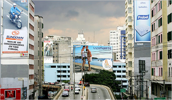
I’m not quite sure why Turner hates awnings so much (I rather like them!), but I had to think of the neon ban when I came across a BoingBoing entry that points both to an International Herald Tribune article, Billboard ban in São Paulo angers advertisers, as well as photos posted on flickr by Tony de Marco showing what the city currently looks like, now that authorities carried out the ban. Wouldn’t you know it, the words “East German slum” came to (my) mind. The “cleaned up” Sao Paulo doesn’t strike me as a pretty sight at all, and yet the 23 comments on de Marco’s photos so far are overwhelmingly in favour of what looks to me like vandalism. Of all the comments, the only truly sane one is from blackmarkets, who writes:
“I love this. It makes the city’s sky seem that much bluer without ads cluttering up your view.” [note: this is what a previous commenter wrote]
Yeah, and the views of the commenters here seem that much screwier, uncluttered as they are by an appreciation of history, art and culture and any tolerance whatsoever of aesthetics beyond their own half-baked asceticism.
The pictures are gruesome enough but the comments are even creepier. Banning the representative artform of our time ( which is what graphic advertising is) from the public sphere (with what little remains to be managed by the some sort of ministry of bus stop signage) is a blow for humanity? Strip the walls of your own cells bare if you want to, my little monks and nuns.
You’re welcome to enact your post-human fantasies in your own rooms ( I might even dig the look if you weren’t intent on enforcing your tastes on the rest of us). But me, I kinda like the planet with signs of life sprinkled here in there–you know the cities, the commercial life that enables them, and the people who inhabit them (notice too the almost total lack of actual human beings in the photos –your aesthetic is obvious enough, buddy. To everyone else but you, most of those above, and, probably, below).
Have no clue what I’m talking about? Here’s a koan for you: no logo = a logo
No kidding, how true. The creepy sterility of the city stripped of signage is breathtaking, bleak, depressing. It’s what Herzog describes in Images of a lost Vancouver, too (the source for the “East German slum” remark). Click over to that article for some images by Herzog.
Below: a photo of Sao Paulo before the signage bylaw went into effect. See de Marco’s photoset to get a sense of what it looks like now…
Those old photos of Vancouver are great. I went there a couple of times in the 1990s and it struck me as rather sterile (like Canberra). Now I know why!
The coffee cup neon in one of the photos is fabulous! I don’t see such variety/originality these days – have often been struck by the fact that nearly all the corporate signs in central Sydney are either blue or red. I wonder why other colours are rare.
Comment by melanie — April 21, 2007 #
Yes, Herzog’s photos are great, and I find it interesting that they’re not straight-out “reportage” or documentary, either. They’re very much of a style, too. I realised this when looking at a couple of the early 80s photos (taken during a time when I lived in Vancouver, too), and noticing that what he chose to record was very particular and not necessarily what I remember seeing, either.
The coffee cup is “White Lunch,” which had some sinister overtones, insofar as it assured the Anglos that no Chinese were running the restaurant… Great sign, though.
The catalog includes a photo taken in the early 2000s, of Granville Street probably (the main street) called Metropolis — after the Fritz Lang film where worker-drones slave for a priviliged class. It’s called that b/c it really does have that machine-uniformity, that sameness, with an “army” of workers all dressed the same passing by, casting shadows, and an architecture that’s sterile as well as unadorned/ undecorated …”pure.”
As for Sao Paulo: Ok, never been there, don’t know how bad the signage problem was (apparently, it was completely out of control), but the response looks horrifying, as far as I can tell. blackmarkets’ comment is bang-on.
I’m hoping to get to the Vancouver Art Gallery before the show ends, see the exhibition in person…
Comment by yulelog — April 21, 2007 #