“Translation:” Themes of the Portfolio
May 5th, 2012
Much of the course focused on how Islam is defined. Who has the power to do so? How do these definitions change in different contexts? How do cultural beliefs and practices interact with the vast array of beliefs and practices that constitute Islam? By looking at the whole breadth of the Islamic world, rather than focusing on one area, we learned how concepts are in effect translated from one tradition to another. Though only one of the explanatory essays explicitly uses the word “translate,” nearly all of the pieces in this portfolio are an effort to translate concepts learned in the course in some way. This umbrella theme of translation encompasses and unifies all of the pieces, and also acts as a bridge between the individual works of the portfolio and the themes of the course.
Melding with the personal
One of the pieces in my portfolio similarly looked at translation, but this time on a personal rather than societal level. The piece “3D Arabesque” was an attempt to make sense of how Islamic concepts and ideas interact with my own identity: a translation into a more personal language. This was a particularly potent piece for me, since it gave me the opportunity to reflect on my own mixed identity. It was not only an experiment on how an Islamic art form, the arabesque, can be melded with a Japanese art form, origami, and what kinds of symbols and meanings can be found in their marriage; but also, as a half-Japanese American, an interesting commentary on what it means to be multi-cultural. This was one of my favorite (and time-consuming pieces); constructed out of dozens of sheets of stiff paper, it is a traditional Japanese art that I learned from my mother and great-grandmother. The final product, a large half dome of artificial flowers, was meant to represent a 3D version of the arabesque, a literal illustration of Necipoglu’s arguments about two-dimensional Western representations of Islamic art. In her view, scholars fail to take into consideration the social and political context of Islamic art, rendering their interpretations of it flat. In the same way that she argues for adding an extra dimension to the study of the arabesque figure, I added another dimension to two-dimensional arabesques. This was in both a literal and a figurative sense: it’s 3D, and I added a foreign element, Japanese tradition.
Bringing to life course concepts
“3D Arabesque” was also part of a group of pieces that strove to “bring to life” various concepts or ideas learned in the course. “3D Arabesque” made Necipoglu’s argument jump off of paper—both figuratively, as described before, and literally, in the sense that it is made from paper. My first creative response, “Heavenly Bowls,” also took a concept about humankind’s relationship with God and brought into the real world. In order to illustrate the description of heaven from the story of Mohammad’s ascension in the series of West African Islamic stories we read, I constructed my own personal heaven from a series of thin tissue paper spheres. Meant to serve as a light shade to a candle, the series of brightly colored nesting bowls represented the thousands of curtains made from every material conceivable separating the mortal soul from the divine. Each human must pass through these curtains in order to enter the presence of God. I symbolized this idea by placing a candle at the center of the bowls; one cannot see the candle itself, but its light can be seen through the tissue-paper-thin shades. In the same way, even though we are separated from God by literally every substance on earth, we can still sense his presence.
A third piece, “Haute Couture,” brings the story of “The Conference of the Birds” to life in a series of “fashion” photos (“fashion” used in a rather loose sense here). Four of the bird characters from the novel are represented in a human form, each with their own personality and backdrop. The personality tropes that Attar describes have been transformed into people that one might see every day.
This project also performed translation in a sense, bringing these tropes illustrated in “The Conference of the Birds” into the 21st century. The characters described are ones that can be found at Harvard. The nightingale has become the lover of wine and romance; the partridge the lover of glamour; the heron an emo, and the duck the showoff student that everybody loves to hate. This last character was modified to better fit the modern setting while still preserving the original duck personality: rather than being a person that complies with every letter of religious law but not with the spirit, it is the student that puts on every appearance of being an excellent student—but has no real love of learning, only for exterior impressions.
“Bringing to life” was also a theme of the general course: through different forms of multimedia, we were meant to experience Islamic art, literature, and spirituality for ourselves. Various movies, video clips, and songs that we listened to were meant to put a face on the concepts we were learning. We were introduced to imams, to a child from Kazakhstan that is memorizing the Koran, to a Pakistani rock star, and to numerous “divas”—and each introduction served its purpose, making it easier to understand and relate to their stories.
Provoking emotion
This project also illustrates a central theme of the collection, of evocation of emotion. Many pieces were created not only with a concept in mind but also with an attempt to provoke an emotion in the viewer. That is, several pieces tried to marry the creativity of the process with the creativity of the final product. In the case of “Haute Couture,” each photo was meant to convey a particular mood: dramatic shadows for the nightingale, glittering highlights for the partridge, and moody blue for the heron. “Heavenly Bowls” was also meant to convey an emotion: a sense of quiet reflection and awe, a moment in which to feel closer to God. The Tazi’ya piece was supposed to be a graphic representation of a symbol of tragedy; though just looking at it might not tell the entire story, the straight edges and colors of the collage hopefully convey a sense of the mountains, and a sense of sharpness. “Translating Persepolis,” an illustration of the protagonist of Persepolis lying in a field, was meant to connote a sense of childish joy and connection with the divine.
Thinking about the reaction of the viewer is something that wasn’t explicitly brought up in the context of the course. However, in the sense that the material was meant to provoke us into thinking about concepts in a different way, this theme did fit in well with the general themes of the class.
Iteration and repetition
A last theme that I didn’t expect to find in my work was that of iteration: many of the projects featured repeated designs. One of the most beautiful concepts that I learned in this course was the idea of repetition as dhikr. Murmuring Allah’s name repeatedly, according to some sects, brings you closer to remembrance of him. It was therefore a pleasure to realize that my pieces in many ways incorporated the idea of repetition.
For example, the ghazal “I am but a mortal” features a rhyme that is composed of a repeated word, “me.” This poem was partially inspired by the ghazal I memorized for the ghazal project, “Guftam gama’ to daram” by Hafez. The beauty of the repetition of the beginning of each line throughout the poem (each line begins with either “I said,” or “he/she said”) struck me in a very profound way; though I didn’t process the meaning of the words in Persian, Hafez’s poetry still had the power to evoke a response. My own poem used a repeated word, “me,” at the end of the line.
“Heavenly bowls” is repetition in a more literal way: the piece is a set of nesting bowls, each slightly smaller than the other and a different color, but the same in composition. Since each was meant to represent one of the thousands of curtains separating us from the divine, I had initially hoped to have many more than just three bowls, but in the end the repetitive effect is still apparent.
In “Translating Persepolis,” the background of grass is illustrated by repeated rectangles in green, with a scattering of repeated flowers on top. I drew my inspiration for this piece from the sumptuous illustrations of Peter Sis for the story of “The Conference of the Birds,” which also features quite stylized, repetitive designs. One of my favorite pages of his work is simply a page full of black birds of all shapes on a white background. It was this image that made me realize the artistic power of repetition. Though “Translating Persepolis” uses this conceit on a smaller scale, the repetitive background pattern dominates the picture.
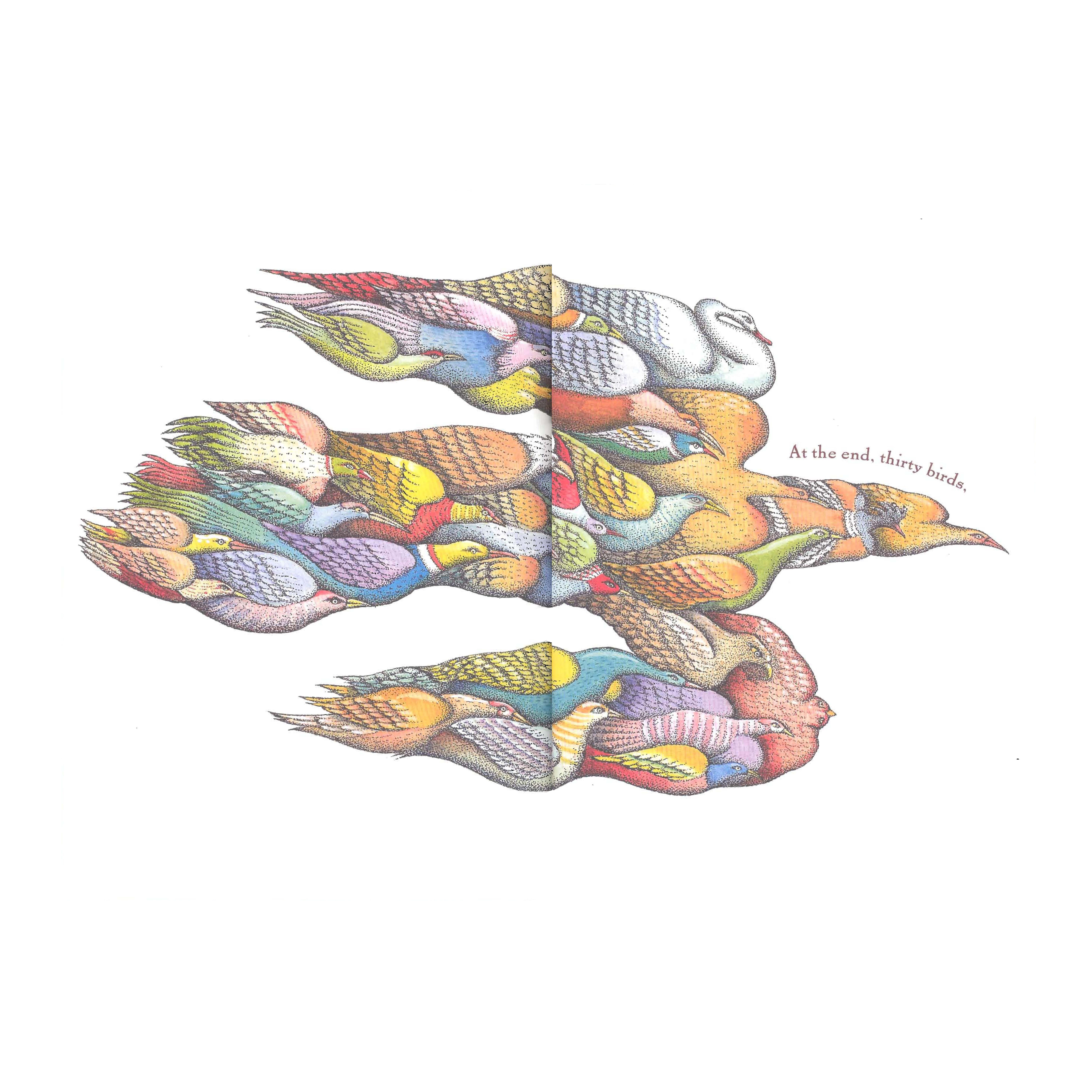
Perhaps most iterative is “3D arabesque,” which is composed of many different units. The squares of paper from which I composed the piece were folded into the shape of a flower petal. Five petals were then put together to form a flower, and the flowers were gathered together to make the final half-dome shape. In other words, not only was this repetition of the base unit, the petal, but also repetition on a more macro level, the flower. Origami kusudama balls are traditionally constructed in this way, with many individual units coming together into a defined whole—exactly the same way that the thirty birds come together as the Simorgh in “The Conference of the Birds.”
A Last Note: Translation Complete
Throughout this course I have been obsessed with translation. In weeks when we were reading original works like the Conference of the Birds and ghazals, one of my response questions was invariably focused on the translation: can we trust the translation to convey the original sense that the author intended? Can we even fully understand a piece when we are not reading it in its intended form? From my limited study of Arabic, I know that oftentimes there is no easy translation: the dictionary entry for one Arabic word can run on for pages, describing the numerous (and often contradictory) meanings of the same three letter root.
Through this course, I have come to understand that translation in a less literal sense, on the cultural level, is also difficult. As some of the authors we read would tell us, some attempts to translate Islamic concepts into something more easily understandable to us are blatant misinterpretations of their true meaning. Nonetheless, in my pieces I attempted to tackle this difficult task of translation. I blended some concepts with parts of my own reality and personality; translated others from the page to real life; and tried to translate a concrete object into an emotion in the viewer. Although some of my “translation” efforts fell somewhat short of expectations (I was a little ambitious when beginning projects, such as the plan to fully illustrate a vignette from Persepolis in a different style!), these projects (and, more generally, this class) has been one of the most rewarding experiences at Harvard.
Redrawing Persepolis
May 5th, 2012
My last project was inspired by a crossover between two weeks, week 10 (which focused on Conference of the Birds) and week 12 (in which we read Persepolis). I loved the story of the Conference of the Birds, and the format of Persepolis, but didn’t see a link between the two until I discovered a newly published book in Lamont. Written and illustrated by Peter Sis, it tells the story of the conference of the birds in a beautiful, reductionist way. A children’s illustrator, Sis focuses on sumptuous drawings that tell his story in a simple but understandable way. Though the format is technically for a child, the language and beauty of the images elevate it to something that an adult can enjoy as well—just like Persepolis’s layout. The translation does not illustrate all of the complexities of the original, but it narrate the story itself in a sparing but poetic way.

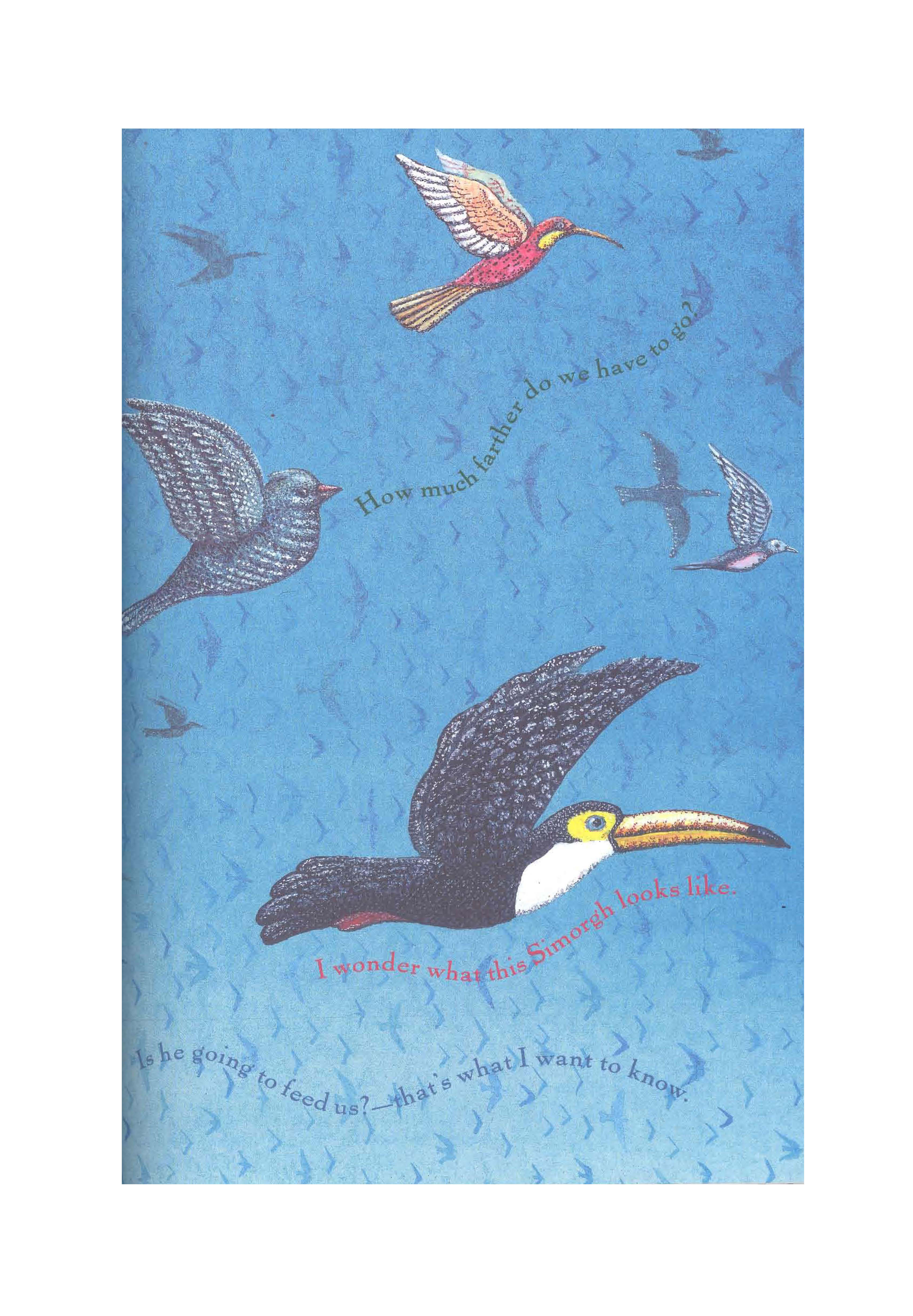
(From Sis, Peter. The Conference of the Birds. New York: Penguin Press, 2011.)
For my last project, I decided to try to translate some of Persepolis into the style of Sis. Stylistically—both in terms of the writing and in terms of the artwork—they differ very greatly, and I wanted to translate Persepolis from one style to the other.
I decided to center on the protagonist’s relationship with God, which I found the most touching part of the story. God appears only peripherally in her narrative, but is clearly an important character—I decided to give their relationship its own book, calling the book “A Love Story.” Though originally I ambitiously planned to tell the entire story, each with about a line of text on the page, I quickly realized (after numerous hours spent on just one page) that I would have to settle for just telling the first sentence of the story. The following image is therefore just the introduction to the story—if I have time, I would love to go finish her story.
Though this doesn’t appear in the abbreviated product I ended up creating, it did initially bother me that in translating formats, I would completely depoliticize a book that was clearly meant to be political. I do think that political or not, any work that highlights the love and power that threads through Persepolis has in some way done the original work justice.
The final image is that of a young girl lying in a field. The caption reads, “Once upon a time there lived a girl that loved God.” The colors are super-saturated, as in Sis’s work, and the style is clearly not meant to be realistic but neither is it cartoonish.

Conference of the Birds, a la haut couture
May 5th, 2012
Imagine my surprise when, while poking around one of my favorite blogs, I saw something about a clothing line called Conference of the Birds. After a little bit of googling, it seems like it is indeed a men’s clothing line, designed by Andrew Holden in 2008 and 2009. Holden’s inspiration for naming the line was indeed Farid Ud-Din Attar’s poem, though there is no explanation for why or how it inspired him. His 2009 spring collection is described as “neutral colored pieces highlighted by the use of sun-kissed hues reminiscent of a desert sunset.”


(photos from http://thefashionisto.com/conference-of-birds-spring-2009-2/)
Inspired by his work—who is this guy, and how did he learn about conference of the birds??—I decided to do my own sartorial take on the Conference of the Birds poem. Rather than designing my own clothing (which seemed far too difficult), I decided to take a page out of “America’s Next Top Model” and Vogue’s book by designing a photo-spread inspired by the characters in the Conference of the Birds. I specifically chose to make it a commercial interpretation of the Conference of the Birds, both because I was intrigued by the fact that Holden had also done so and because I liked the idea of idealizing different human flaws as a statement about media and representation. Each of the tropes depicted in the spread present the character type as positive (for the dreamer, for the romantic, etc.), while in Attar’s version they are decidedly not flattering.
I chose to recreate the Nightingale, the Duck, the Partridge, and the Heron, and chose outfits and photo-settings to represent what each stands for. Initially, I had hoped that the photos when superimposed or when viewed together would give the observer a sense of unity, to symbolize the composition of the Simorgh by thirty different birds, but I ended up not illustrating all of the birds. The fact that the same person is pictured in three of the four photos, however, perhaps implies that each of the birds’ characters represents just one aspect of the same being.
The Nightingale’s excuse:
The nightingale made his excuses first.
His pleading notes described the lover’s thirst…
‘The secrets of all love are known to me,’
He crooned. ‘Throughout the darkest night my song
Resounds…
I am so drowned in love that I can find
No thought of my existence in my mind.
Her worship is sufficient life for me,
The quest for her is my reality
The nightingale photo was the easiest, since I have a pair of lovebirds living right next door to me. The caption reads, “For the romantic…a red dress and red wine make the perfect match,” drawing the connection between wine, drunkenness, and love that is often made in Sufi love poetry. I chose to leave the face of the beloved unrevealed, implying that the identity of the object of love might not be the most important factor in the relationship—on the contrary, the most important factor may be the lover’s sense of romance.
The Duck’s excuse:
The coy duck waddled from her stream and quacked:
‘Now none of you can argue with the fact
That both in this world and the next I am
The purest bird that ever flew or swam…
There’s no doubt in my mind
That purity like mine is hard to find.
Among the birds I’m like an anchorite—
My soul and feathers are a spotless white.
I chose to interpret the idea of the duck within the Harvard context. The duck in this case is not the overly-observant and underly-spiritual worshipper, but instead a Harvard student that is more focused on appearances than content. The caption reads, “For the showoff…hit the library in style,” implying that the model’s objective in going to the library is not to study, but only appear to be studying.
The Partridge’s excuse:
The pompous partridge was next to speak…
He clucked, ‘My one desire
Is jewels; I pick through quarries for their fire.
They kindle in my heart an answering blaze…
To yearn for something other than a jewel
Is to desire what dies—to be a fool;
Nothing is precious like a precious stone.
The partridge image is fairly straightforward. The lighting has been created in such a way as to make the jewelry stand out more, just as precious stones might stand out against the dull plumage of a partridge. The caption reads, “For the lover of glamour and shine…diamonds are forever.” The composition of the photo—with the neck clearly the center of attention and the identity, face and body of the subject obscured—reiterates this idea, implying that even though mortal life is transient, cold hard stones remain constant.
The Heron’s excuse:
The heron whimpered next: ‘My misery
Prefers the empty shoreline of the sea.
There no one hears my desolate, thin cry—
I want to sorrow there, there mourn and sigh.
I almost decided to represent the heron as an ‘emo’ hanging out in Harvard Square, but in the end decided that interpreting the heron as a dreamer was more appropriate for the context of a fashion layout. The sea not being readily accessible, the next best thing was the river. A long flowing blue dress, black shawl and unkempt hair were meant to illustrate the mournful, depressed demeanor of the heron, while the blue tones that dominate the photo were meant to express the melancholy beauty of the ocean.


Ghazal 1: “I am but a mortal…”
May 4th, 2012
I am but a mortal and you, my Aphrodite
I fear to forget my lowly place lest you smite me
I am a book of scribbled pages and empty lists
But with the strength of your spirit you could rewrite me
The match dies in the fire but only then does it live
The heat burns hot, my love, but your presence ignites me
None since white Lancelot has suffered such love as this
My beloved! I kneel and beg you to knight me
I own no sword but a pen and no lance but my voice—
No champion I, but to heroism you incite me
I ride forward to a trial I’ve lost already
Hang me on your gaze, for by your lips you indict me!
When on the docket I stand charged with crimes of passion:
Confess, Anna: even your cruelty delights me!
I chose to attempt my own ghazal as a creative response to week 9, and I must say, after this experience I am even MORE glad that I chose memorization instead of composition for our graded project—writing a poem that doesn’t sound trite, still rhymes, and has somewhat coherent thoughts is quite a challenge. Other poetry I’ve written was limited to freeform poetry, so this was a completely new experience for me, and really served to broaden my poetry horizons.
I drew inspiration from the Agha Shahid Ali article about ghazals in English, both from the poetic devices he discusses and from his challenging assertion that most writers of ghazals in English “get it wrong.” The repetition at ends of lines that I use is similar to the format he uses in one of the ghazals in his article (“The only language of loss…”). I particularly enjoyed the use of repetition since the ghazal I memorized (‘Guftam ghama to daram,’ by Hafez) made use of the same kind of repetition, and I found the lyricism of it quite beautiful. If a non-English speaker had to memorize my poem, I hope that they would have the same experience with it! In addition, I’ve never seen poems that use a repetitive phrase to construct a rhyming scheme, so I found it fascinating and a bit foreign-sounding. I also took care to make every line the same amount of syllables. I certainly couldn’t write in meter, but this was the next best thing, and Ali seemed to agree.
Like most ghazals, mine focuses on unrequited love. I tried to follow the tradition of evoking familiar symbols—but since I grew up in a Western tradition, the figures I chose were Aphrodite, Lancelot and Guinevere rather than Majnoon and Layla. I also tried to make use of wordplay. For example, pleading with the beloved to make me their champion transitions into a contradictory analogy of the lover as criminal, prosecuted by the beloved. The link between the two is “trial,” which can mean both the formal requirements that knights had to go through to receive their shield, or a modern-day court trial.
Unfortunately, I couldn’t come up with a good enough nom de plume, so I simply left my name as is in the last line.
Minimalist Ta’ziyeh
March 25th, 2012
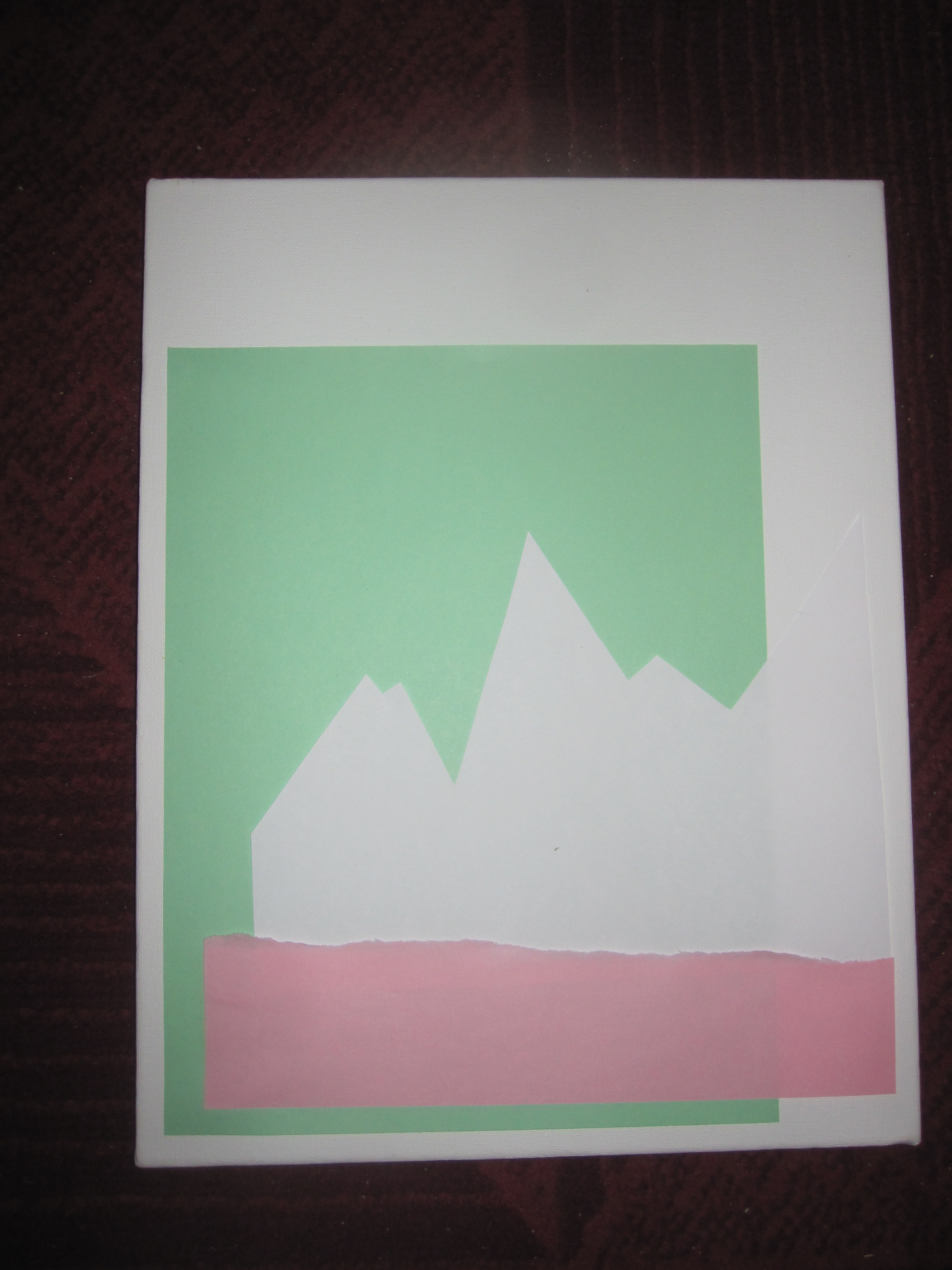
My third response was inspired by the Ta’ziyeh of Iran. I was intrigued by the symbolism that pervades the passion plays, particularly that of structure and color. I particularly liked the idea that the plays don’t need to depend on complex sets, costumes, or production, since the story is capable of standing on its own. In addition, the emotional response that this simple symbolism can provoke is striking: the Ta’ziyeh in many ways represent pure, stripped-down emotion.
I wanted to mimic the evocative nature of the plays in a piece of artwork, and decided to do so in a minimalist way, depending on form and color rather than creating a piece of representational art. The colors were chosen to correspond with the colors that usually appear in Ta’ziyeh: green and white for the protagonists’ colors and red for the villains. The white background is meant to represent the sense of martyrdom that underlies the story, which is central to both Ta’ziyeh and Shia Islam, since white is considered to be the color of death in Islam. The large green rectangle represents the sense of faith that is responsible for the martyrdom, since green is often used to represent Islam. The jagged white shape symbolizes the violent deaths that occur in the story, while the rough red shape at its base represents the blood that was spilled as well as the undercurrent of ill-intent that pervades. The piece as a whole is supposed to evoke a mountain landscape, the setting of Hussein’s final confrontation with Yazid.
East meets Far East: adding another dimension to the arabesque
March 25th, 2012
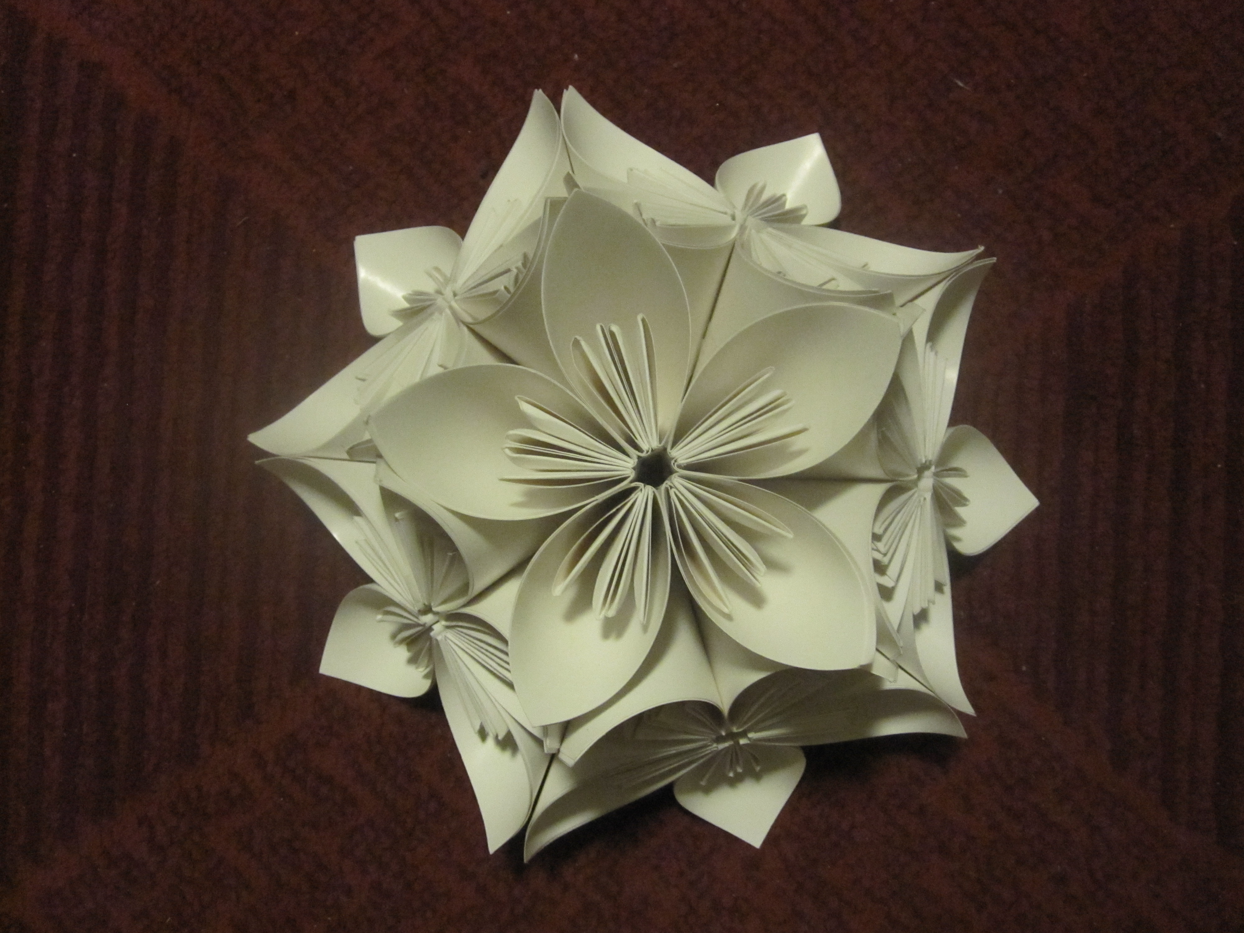
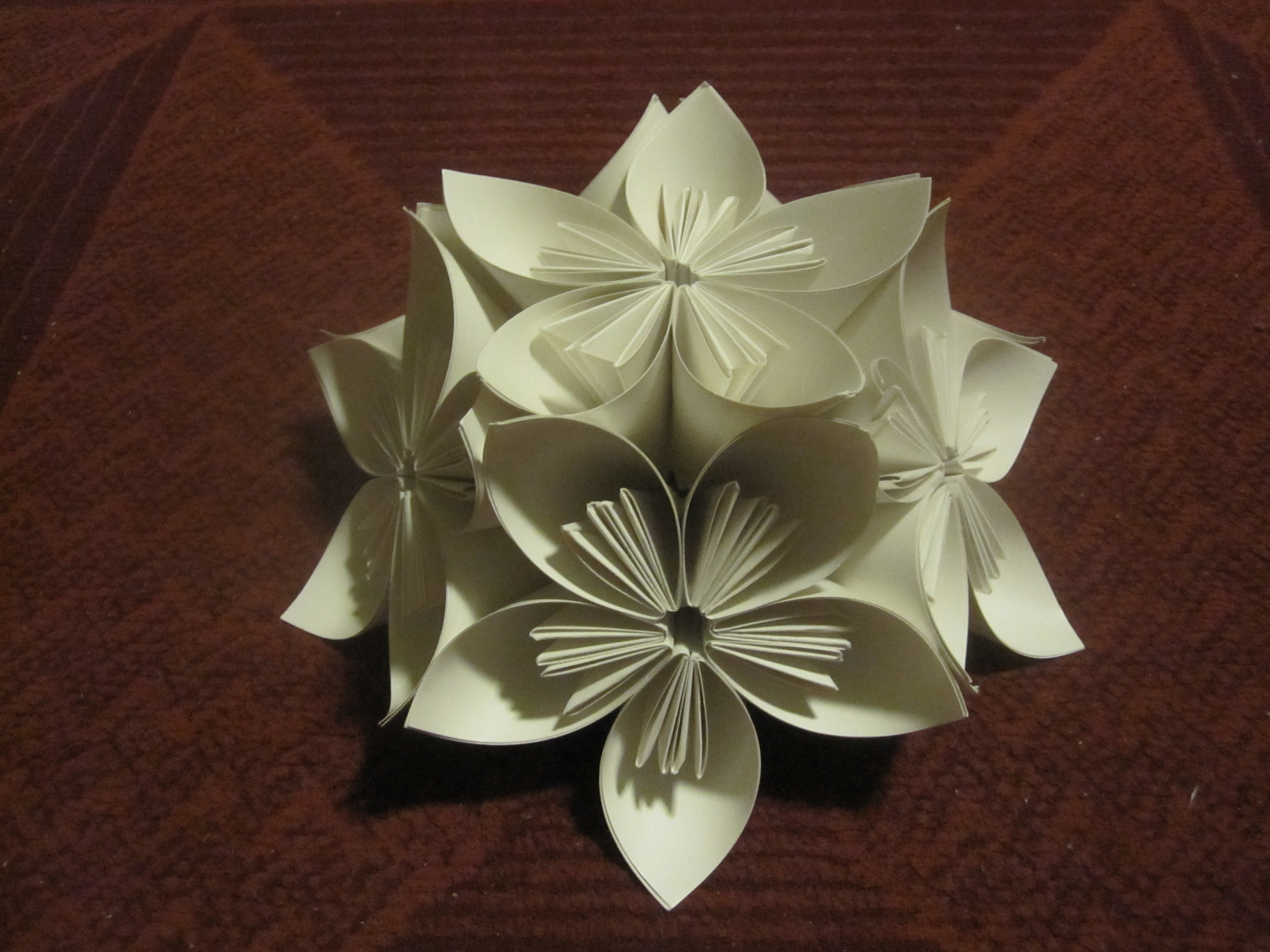
My second creative response was inspired by Necipoglu’s piece about the arabesque in Islamic art. I have always been interested by tessellations, of which Islamic tiles and designs are some of the most beautiful and complex examples. Drawing on my Japanese heritage, I decided to create a 3D version of an arabesque. This was partly because I wanted to create a hybrid piece that demonstrated the crossover between the art of different cultures, partly because I have a particular love for the art of Kusudama ball folding, which my grandmother taught me, and also partly because I wanted to show in a more representational way the crux of Necipoglu’s argument: there is always another dimension to consider. In her article, she argues for the consideration of socio-cultural context in looking at Islamic art; in my piece, I literally added another dimension to a repeated floral design. In addition, introducing Far Eastern elements into a conversation about “Oriental” art seemed to be a direct refutation of the idea of “Oriental” art itself, in the Saidian interpretation of the term, since it is a demonstration that the form is in fact not static and lends itself well to multiple interpretations.
Though in traditional Kusudama ball art, the finished project is—as one would guess—a ball, I ended up creating just a half of a sphere. This was due to constraints of time and supplies (the finished ball would have required a total of 60 folded units!). As it turns out, half of a Japanese Kusudama ball corresponds to my half-Japanese identity, so stopping halfway through ended up being oddly appropriate for me.
The design that I chose is a floral design, composed of five petals. As Necipoglu points out, many motifs in Islamic arabesques are based on natural sources of inspiration. When put together, the different flowers (of which there are six) fit each other neatly, just as the components of an Islamic design also fit each other neatly.
Heavenly Curtains
March 25th, 2012

I drew my inspiration for my first creative piece from the Knappert reading from the fourth week, which recounted stories about Mohammad from the Swahili Islamic tradition. I was particularly struck by the story’s description of heaven, which is described as Mohammad ascends to heaven to meet God. The different levels of heaven are made out of different materials (copper, silver, gold, rubies, and diamonds), and are followed by a series of curtains behind which God is present: “At last I arrived at the First Curtain. It was created out of iron; an angel was there to take charge of me and to hand me over to the angel at the next curtain. There were altogether 70,000 curtains separating the divine presence from the rest of creation. The curtains were made from every conceivable substance or element.” The purpose of these curtains is never explicitly explained, but it seems that they are a barrier between the human and the divine, the last separation before humans are brought into the presence of God. One must literally pass through all the elements before coming into God’s presence.
The idea of a veiled divine presence appealed to me, since to me it illustrated the different levels of understanding that humans must go through before they are able to find God. I decided to create a symbolic representation of this divide between the human and divine in sculpture form. God is represented as a light; the different curtains are represented by three different spheres created out of different colored tissue paper. Although originally I had conceived of more than three different spheres, made out of different materials including thread, ribbon, tissue, paper, in order to better approximate the 70,000 curtains described, technical failures resulted in just three differently colored tissue paper spheres. Though it was difficult to photograph how the light penetrated through all of the shades, the idea was that the light would be visible even when the candle itself was obscured—an indication of how overwhelmingly bright the light would be once the shades were removed.
Something that struck me as I completed the project was the fact that the spheres were constructed around negative space: the method that I used to create them was to blow up a balloon, to which I glued pieces of tissue paper. After drying, the balloon was popped, but the shell of tissue paper remained. It is a standard papier mache technique, but in the context of this project it seems particularly appropriate. The story illustrates the simultaneous longing for God and striving and longing to come into his presence and the overwhelming sensation of his presence: when Mohammad passes the last curtain, he faints, presumably out of ecstasy at literally coming into God’s presence. The negative/empty space that filled the balloons, when the candle inside is lit, is transformed from being merely shells to being receptacles of Godly presence, just as humans are filled with divine light upon becoming one with God.