
In August 2021, I was approached by a journalist who had some questions about my design of the Windows Start Menu and Taskbar.
Can you tell us a little bit about your background before Microsoft, and how much impact your work on behavioral science had on your time/contributions there?
As an undergrad at Harvard, I was the last student of the behavioral psychologist B.F. Skinner, who served as my thesis adviser. I collaborated with him on chimpanzee language research. I later went to grad school in psychology at Harvard.
I think that my training in behavioral psychology and my research experience were important for my work at Microsoft. They gave me some useful tools — and at that point, a unique perspective — for understanding how people use computers. I think the work with chimps, in particular, gave me some ideas about how to make things easier.
Did you apply for the job at Microsoft, or were you asked?
While I was in grad school at Harvard, I sent email to a college friend who worked at Microsoft. This was probably in early 1992. It might sound hard to believe now, but at that point, email systems weren’t routinely connected to the Internet. So my friend was actually impressed that I’d figured out how to send email across the Internet, from Harvard to Microsoft. He told me that I should apply for a job!
I didn’t apply right away, but not long after, I won a National Science Foundation fellowship to spend the summer in Japan doing research on human-computer interaction. When I got back from Japan, the idea of working for a software company sounded more appealing to me than going back to grad school. So I sent a resume to my friend at Microsoft, and I eventually went out to Seattle to interview. I got offers from a few teams, including Excel and Windows. Although my friend discouraged me from joining the Windows team, it sounded more interesting to me, so that’s the offer I accepted in October 1992.
What was the job description/brief?
I was a program manager in the Personal Systems Group, working on the user interface for Chicago, which was the code name for the next version of Windows.
How did you feel when you got the job?
I was excited. It seemed like an adventure. I had never lived on the West Coast before, so the location was probably as appealing as the job itself.
It might be hard to appreciate now, but in 1992, Microsoft didn’t have anywhere near the visibility that it has today. I remember that when I told my grandmother that I had taken a job at Microsoft, she said something like, “Do they make microwave ovens?”
A funny thing to note is that I hadn’t been a Windows user before I got to Microsoft. I had exclusively been an Apple user, beginning in 1979 with an Apple II Plus, and later a Mac. So it felt a little weird to be working on Windows.
My first day at Microsoft was the first time that I had used Windows for more than a few minutes. And I found it so confusing! I remember asking my manager how to do something really basic in Windows. He laughed and said, “How did we hire you?” When I interviewed, I don’t think it ever came up that I hadn’t been a Windows user.
Looking back, not being an experienced Windows user turned out to be a huge advantage. There’s a great quip that’s been attributed to the media theorist Marshall McLuhan: “It probably wasn’t a fish that discovered water.” Because I hadn’t been immersed in Windows previously, I think I was able to see things that long-time users didn’t notice.
What state was Cairo/the Cairo UI in at the time you joined Microsoft?
In the fall of 1992, Cairo was a work in progress. It was being designed as a potential UI for a future version of the operating system that shipped in 1993 as Windows NT. Initially, our plan was to take whatever UI elements the Cairo team had designed and integrate them into Chicago. Mostly, though, that didn’t work out. It was easy for us to add Cairo’s NeXT-inspired, gray, 3D look and feel. But when we implemented the functional elements of Cairo — the way that people use the computer for basic tasks like opening programs or finding files — we found in usability tests that the Cairo UI was too hard to figure out. And that was really the genesis of my work. I was trying to make something that was easier.
What state was Chicago/the Chicago UI in at the time you joined Microsoft?
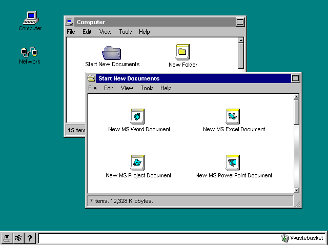
When I got to Microsoft in November 1992, I think the Chicago builds looked pretty much like Windows 3.1. Soon after, the shell team implemented some of the UI elements designed by the Cairo team. The image below is probably a bitmap mock-up, not a screenshot from running software, but it’s close to what Chicago builds looked like in early 1993. And that’s around the time that we began usability testing, ultimately concluding that the Cairo UI wouldn’t allow us to achieve our goal of making Windows easier and more appealing for a general, non-expert audience.
What was the brief you were given for how you were to help with Chicago?
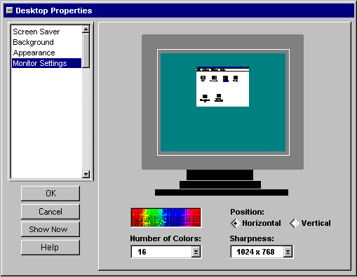
Initially, I worked on the UI for the Windows control panel — or “property sheets,” as we were calling them. Here’s one, with a little picture of a monitor that lets you preview the wallpaper or screensaver that you’ve selected, that I designed on November 19, 1992 — my fourth day at Microsoft:
I was also focused on what we called “user assistance,” which was basically the help files. I had this notion that we’d transform the static help function into something more interactive.
It wasn’t my job at first to redesign the shell. But when our usability testing demonstrated the limitations of the Cairo UI, I realized that we needed something different.
What gave you your initial ideas for the Start Menu and Taskbar?
Watching people struggle in the usability tests was my primary source of ideas. I was trying to solve the problems that they had.
Did you have any particular inspirations or visions that influenced your work?
I was well-versed in the history of the graphical user interface, going back to work at SRI and PARC in the ’60s and ’70s. There was even an old Xerox Star at Microsoft that I played with.
How did you plan your designs/concepts?
Mainly, I made things — bitmaps in Paint and prototypes in Visual Basic — and showed them to my colleagues and people in usability testing sessions. Looking back, Visual Basic was incredibly important to my work. VB was only about a year old when I got to Microsoft, and it empowered me to do more than just make sketches. In a couple of hours, I was able to make a prototype that you could actually try out. There’s no substitute for that. VB turned out to be crucial for getting feedback from users and sharing my design ideas with colleagues.
Were there any other designs/concepts before Start/Taskbar? Could you share these?
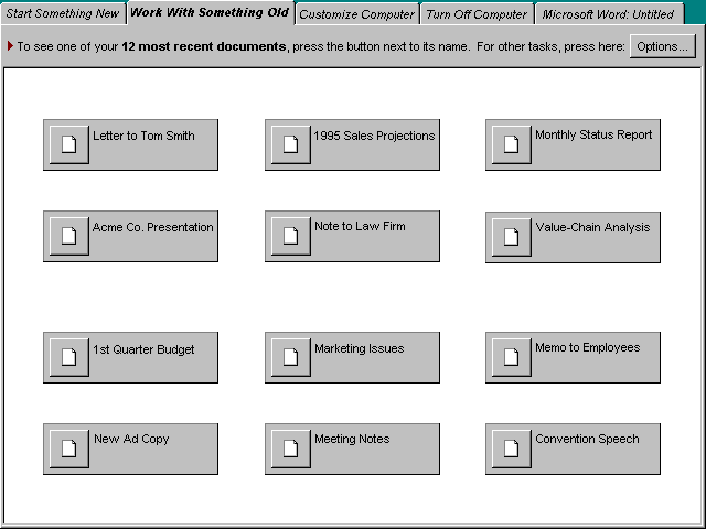
Initially, I came up with a simplified shell that I called ClearView. It had a tabbed design, similar to the way that modern web browsers look.
How long did it take you to come up with the initial ideas for the Start Menu and Taskbar?
I have a folder full of old bitmaps and VB prototypes from Microsoft, and the timestamps are still readable, so I can see when I worked on various projects.
In May 1993, I worked on ClearView, the simplified shell. And then I did virtually all of my work on the Start Menu and Taskbar in June 1993. Later in the year, there were some elaborations — like the notification area on the right side of the Taskbar that I designed — but, to my surprise, I’m realizing now that I did most of the work in one month.
I should add, though, that I had spent about six months before that immersed in usability testing. So I came to the work with plenty of food for thought. I think I really understood our customers’ needs pretty well.
Who was the first person you shared your Start Menu and Taskbar ideas with, and what was their reaction?
I don’t remember for sure, but I often worked late into the night — especially when I was creating VB prototypes — and my night-owl schedule usually overlapped with the hours of the developer in the office across the hall, Ian Ellison-Taylor. He probably saw a lot of the stuff that I came up with as early as anyone else.
I wish I could say that everyone immediately loved my Start Menu and Taskbar. But that wasn’t the case. It took months before my design won over some of the skeptics. Even when I moved back to Boston in 1994— I had taken a leave of absence from grad school at Harvard — it wasn’t certain that Windows was going to ship with my Start Menu and Taskbar.
Why did you choose the name “Start”?
“Start” was a replacement for my initial name, “System.” In usability testing, people were uneasy about clicking a button with that name. I guess it sounded too technical or complicated. That’s why I changed it to “Start,” which I had also used in ClearView, the simplified shell I’d designed previously. I intended for that menu to be the first step for the most common tasks, and “Start” was both a description and a hint. In usability tests, people immediately knew what to do.
What was the process for usability testing? How did you determine what users found “best,” and how long did the whole process take?
Microsoft had just built a suite of usability testing rooms with one-way mirrors and cameras, so we benefited from that. We would bring subjects in one at a time, and give them a written set of tasks to complete. I would sit in the control room — with Kent Sullivan, who ran the testing sessions — and watch users through the one-way mirror. We would record how long it took to complete tasks, and also jot down our impressions. Each session lasted about an hour.
Do you have any unexpected/funny stories from during usability testing?
I vividly recall one session when we were testing Windows 3.1. I had one of the developers for the shell with me. I wanted him to see firsthand what we were up against.
The subject of the usability test was an experienced computer user, but he had never used a graphical user interface before, which wasn’t uncommon in the early ’90s. One task was to simply open Microsoft Write, the basic word processor that shipped with Windows. It took him about 20 minutes to figure out how to do that.
After the session was over, the developer surprised me by saying, “We really have a problem.” Usually, the developers would insist that everything was fine the way it was.
But then he explained what he thought was the problem: “We need smarter customers,” he said, only half-joking. “That guy is a moron!”
I looked over the questionnaire that the subject had filled out. It turned out that he was an engineer at Boeing. He worked on propulsion systems. He was literally a rocket scientist, and even a rocket scientist couldn’t figure out Windows.
The developer and I laughed, and that became a defining moment for the Chicago shell team. At the very least, we were determined to make Windows easy enough for rocket scientists.
What was the process that led to the final positions of the Start Menu and Taskbar, at the bottom (left) of the screen, and why? Was there a worry that on top would be too Mac-like?
There wasn’t a formal process. I designed the Start Menu and Taskbar for the top of the screen, and for years after, that’s how I arranged them on my own computer. But for a variety of reasons, including differing aesthetic judgments and concerns about any perceived similarity to the Mac, there was pressure to move everything to the bottom.

Was there a Plan B beforehand, in case your now-final Start and Taskbar designs didn’t work in usability testing?
If the Start Menu and Taskbar hadn’t been so successful in usability testing, I would have continued to try to design something better. Fortunately, that wasn’t necessary.
Was there anything you wanted to implement but couldn’t at the time, for whatever reason?
At the time, I really liked my earlier ClearView design, but looking back, we were probably better off with my Start Menu and Taskbar. I don’t think that ClearView would have scaled well or survived as long.
Why did the original Start Menu not have a search box? Was this thought about at all?
Searching in Windows was pretty rudimentary in 1993. There was no full-text indexing, so it didn’t work that well. It wouldn’t have made sense to emphasize searching.
Why did you choose to design a menu and bar rather than, for example, a dock?
I was designing using the UI widgets that I was familiar with in the early ’90s. Buttons and menus were fundamental, so it was natural for me to use those as the basis.
What did you enjoy most about your time at Microsoft?
I enjoyed the design work I did. It was such a creative and productive period.
How do you look back on your experience at Microsoft/working on Windows?
It was one of the most memorable and impactful things I’ve done in my career.
Did you think about the longevity of your designs, for example, did you think people would still be using your designs in 2021?
In 1993, I never would have predicted that my Start Menu and Taskbar would last so long. It’s surprising to me.
What are your thoughts on how the Start Menu and/or Taskbar have evolved over time (98: Quick launch, XP: grouping, Vista: sidebar, 7: pinning, 8: no Start button, 10: addition of Cortana, task view, People, etc. buttons)? Is there a single best iterations in terms of usability, discoverability, etc.?
I haven’t closely followed the evolution. From a distance, it seems like the changes have mainly been cosmetic.
Is there anything you would add/change to today’s Start Menu and/or Taskbar?
I designed the Start Menu and Taskbar in 1993 for a very different computing environment. Instead of incrementally improving such an old design, I’d try to come up with something that better serves today’s computer users.
How do you feel about your creations being globally recognized?
It’s awesome and almost inconceivable that billions of people have used my Start Menu and Taskbar. I never would have imagined that in 1993.
Would you ever go back to operating system design?
Sure, I think I would enjoy that. In answering these questions, I’m reminded of how much fun I had working on Windows.