If the story of the freshman vote is one of relative stability, than the house electorate is best described as uncertain, if not chaotic. Remember that graph we showed last week of the percentage of the freshman presidential electorate that voted in just the general election, just the presidential election, or both? Well let me remind you:
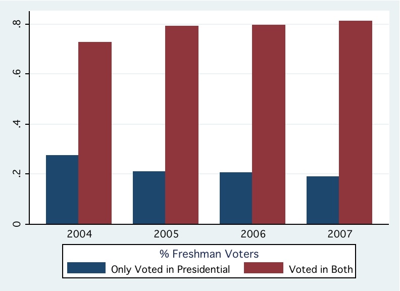
Whoa, only around 20% of freshman presidential voters were first time voters! 80% had already cast a ballot in the fall general elections. Let’s look at a corresponding graph for the upperclassmen:
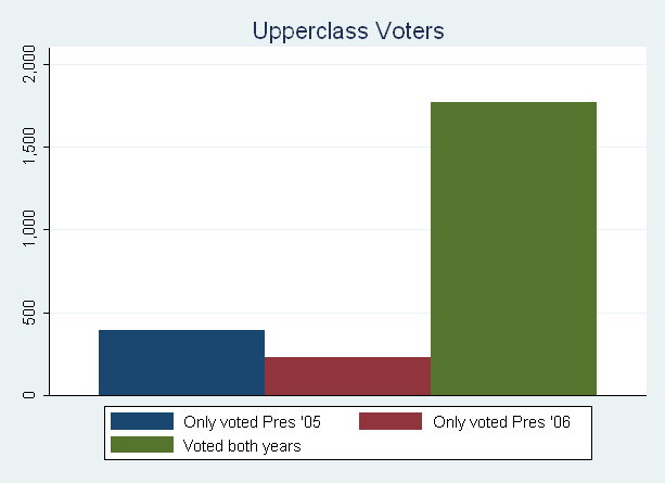
From this graph it appears that upperclassman voters are more static than freshman voters. 88% of voters also voted in the previous presidential election; only 12% were “new.” With only 360 “new” voters every year, things should be relatively stable, right?
Wrong. It looks like the replacement of 1/3 of each house each year with new individuals significantly distorts what would otherwise be a stable system. This graph of the percentage of upperclass turnout represented by each house each year shows some of the volatility:
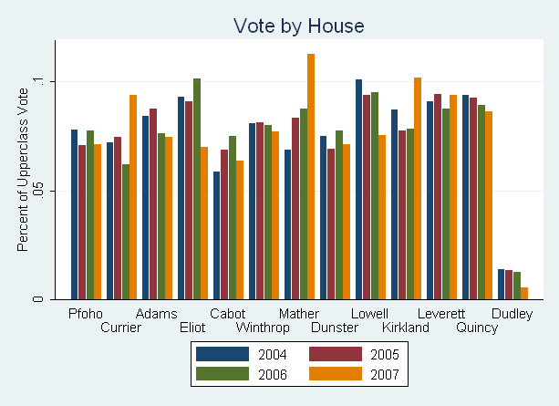
Almost half of the houses posted at least a 25% difference between their best turnout years and worst turnout years. For a house like Lowell that amounts to a swing of up to 78 voters, assuming constant turnout. Extrapolate that across the 5 houses that showed high volatility over the four years examined, and that’s another 350 voters that are highly mobile, even if they don’t show up in the topline numbers. With at least four high-profile candidates each year, it’s not unreasonable to think that a concerted upperclass effort by every campaign couldn’t pump up turnout by this amount in each candidate’s home house, as well as a couple of others. There are lots of untapped votes here.
But turnout isn’t the only thing that should pique campaigns’ interest. Look at this graph. It takes the difference between the percentage of votes in each house going to the election’s overall winner and the overall second-highest votegetter, and then subtracts the overall percentage difference. In short, it shows how much the winning candidate overperformed or underperformed in each house compared to his or her overall margin of victory.
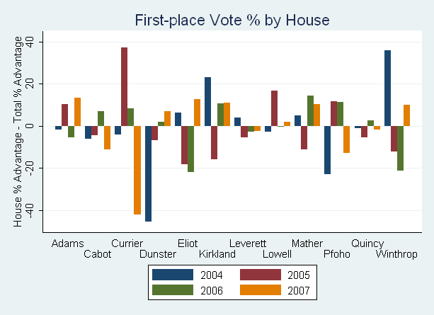
Before we get into this too much, a couple things to keep in mind. First, it’s easier for the graph to go far into the negative than far into the positive, since the upper limit (100%) is closer to the winner than the loser. Second, a lot of the volatility is a product of home-house advantage (which is very very real).
Beyond those caveats, one thing stands out: there’s a hell of a lot of volatility. When you remove any home-house observations from the analysis, you still end up with a standard deviation of 10 points, meaning that it’s relatively common for swings of up to 20 points above or below the overall margin of victory to occur in a single house.
Also interesting are those houses that don’t move around much: Quincy and Leverett. Given that — statistically — the swing in a house should exceed 10 points 31% of the time, it is statistically significant that these two houses showed no swing of this magnitude in the eight observations we have.* Couple this with the fact that these houses advanced presidential or vice-presidential (2005+) candidates in two of the years, and there’s something unusual going on here.
My guess is that a combination of factors lead to large-house stability. First, it’s more difficult to create a large percentage swing because of the greater population. This result probably wouldn’t look as startling if we looked at just the raw numbers. Second, it does seem like these big houses have a different atmosphere than the smaller ones. Quincy’s house community is dull — its HoCo didn’t even put on a tailgate at Harvard-Yale, and its dining hall is a smorgasbord of people from every which house. Leverett has the division between Old Lev and the towers, and an overzealous master who probably reduces the space available for students to build their own community. But most importantly, I think campaigns just don’t try. The only example I can remember of a campaign putting some effort into winning Quincy or Leverett was the Zaidi-Lee attempt in 2006, and they did rather well (see note). I think candidates sometimes forget that nobody knows who they are, and the premise that upperclass voters already love or hate the candidate is false.
So what’s the take-away? Last time we found that the number of “loose” votes based on electorate composition and turnout variance is somewhere between 180 and 300, and probably closer to the lower value in a high-profile year. Variation in the upperclassman electorate alone blows this away, with around 360 “new” voters. Tack on the turnout variation in individual houses and the extreme swings in candidate support by house, and there are 700 relatively-persuadable voters out there waiting to be dragged to the UC website. To be fair, there hasn’t historically been a huge swing when you compare upperclass support to overall support (in large part because upperclassmen typically make up 75-80% of the overall total). But as we’ll look at in a later post, the recent trend has been to focus on freshmen, and a campaign that spends some serious time working the houses would destroy a freshman-focused opponent.
*Note: Zaidi-Lee (the 3rd-place ticket in the 2006 race) posted a 16 point gain on Petersen-Sundquist and a 15 point gain on Hadfield-Goldenberg in Leverett. Excluding the two observations from 1st and 2nd place candidates and the Zaidi-Lee observation, it remains statistically significant given that no observation had a swing of greater than 5.5 points (i.e. the probability that none of five observations would have a swing bigger than 5.5 points is less than 5%).
**Note: All freshmen statistics use the lower bound of estimated freshman turnout, where necessary. See here.