How many classifieds apps are out there? In my review of Craigslist Mobile, I observed about a dozen in the Apple App Store and 20 in Android Market (aka Google Play). Why they exist is not a surprise — Craigslist is the most popular local classifieds marketplace in existence. But what I did find surprising were the poor design, user interfaces and user flow (collectively known as user experience, or UX) that had gone into the apps. For instance, as I noted in the Craigslist Mobile review concerning the classified app UX:
” … The Craigslist Mobile UX is not helped by placing all required fields right next to each other on the same page, which requires lots of text input and screen manipulation, and increases the chances of making a mistake. The ‘add photo’ button takes users to stored photos on the iOS device; a separate button accesses the camera directly.”
There were many other UX issues identified in the review. Options crowd each screen and are hard to find or activate, users are forced to navigate back to the home screen to change settings, strange color schemes are used, text rather than photos dominates the browsing experience, etc. Some of these issues relate to Craigslist’s requirements for listings, but others are the direct result of choices the app designers made. Despite the crowded field, the designers of other apps often decided to copy what was already out there rather than innovating on UX and differentiating themselves.
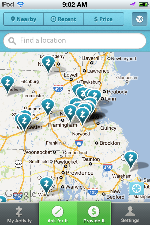
Is there any other way to do classifieds app UX? Certainly. EggDrop, Zaarly and Rumgr point the way, with a user-centric (rather than engineer-centric) approach to design, UI, and user flow. There is no clutter on the small screens. Good color choices were made by the designers. Images and maps look sharp. It’s easy to find what you’re looking for, switch views, or change options. This is the way classified app UX should be.
An example of good UX: Zaarly