Minimum Viable Product, or “MVP”, is a startup buzzword that is actually a powerful concept for product development. It basically means creating a product that has just enough functionality for early customers to use, and helps guide future development. It greatly shortens feedback loops and can help companies avoid investing huge amounts of resources designing more complex products or features that customers don’t want. Building an MVP is a central part of the “lean startup” approach espoused by Eric Ries and others, and is used by startups and even larger companies to build Web, mobile, PC, and enterprise software. This post is about a variation known as MDP, or Minimum Delightful Product.
I first heard about this interesting twist on MVP from startup veteran and marketing guru Adam Berrey. In a 2011 email about a consumer app my company was developing, I mentioned MVP. He noted the importance of design and user experience (UX):
“For consumer apps, I like to think about ‘minimally delightful product (MDP)’ instead of MVP. The reason for this is that in the consumer world ‘viable’ isn’t really compelling. It’s like someone in the ICU. They are alive, but not really fun to hang out with. Create a product with just enough features (lean) and the right UX to be delightful, and you’ll capture the passion of consumer users.”
Taking a prototype from MVP to MDP
Adam’s idea resonated with me — imagine taking the UX to the next level in an MDP. It might take extra time, but there would be a payoff in terms of better adoption rates for the new product, which translates to more plentiful and more accurate feedback and usage data. MDP lets people get past potential qualms about simple UX or amateur design elements, and spend more time on the products features. These experiences can help founders identify what needs to be improved or jettisoned for the next version.
MDP can also result in better word-of-mouth loops, both online and off. I once heard Mint founder Aaron Patzer talk about the launch of the personal finance tracking website, and how paying attention early on to UX and design elements like fonts, the number of screens and even the name of the service led to viral growth as users told their friends about the service. Marc Hedlund, the CEO of Mint competitor Wesabe, acknowledged that this factor contributed to Mint’s success … and Wesabe’s eventual demise:
“Mint focused on making the user do almost no work at all, by automatically editing and categorizing their data, reducing the number of fields in their signup form, and giving them immediate gratification as soon as they possibly could; we completely sucked at all of that. … It was far easier to have a good experience on Mint, and that good experience came far more quickly.”
Naturally, getting to “delightful” may be a challenge. Design and UX choices can be complicated. They can also be very subjective — what appeals to one group of users may not work with others.
MDP examples: Bikes to books

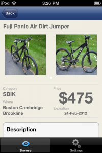
For my old company, we employed MDP in early versions of our product, which was a classified app. People loved it. It looked better in the app store, which resulted in more downloads. The app also had engagement rates that were well above the norm — something like 20% of users were still using the app a month or two after downloading it, and average session times were several minutes long.
<!–

–>
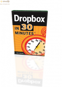
I also used the MDP concept for my second startup, In 30 Minutes guides. While I employed an “MVP” to test the idea (a Dropbox book in ebook and paperback formats) I quickly swapped out my amateur cover for a professionally designed cover, which resulted in more sales and a brand identity that I am still using today.
Update: Adam Berrey, the marketing expert who coined the phrase “Minimum Delightful Product”, has since written his own blog post elaborating on the MDP concept.