The Sunday Diigo Links Post (weekly)
-
Paula Scher: Who Gives The Best Info? A Short History Of Information Design
Brilliant article by Paula Scher on the current craze for info-graphics. Conclusion:
QUOTE
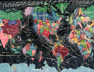 All of the charts, graphs, diagrams, and maps look interesting and involving. They are designed to appear scientific and very believable. They are immediate, even urgent, and you have the sense that you are about to learn something. They are all part of an increasing trend away from reading, reflection, and understanding the world in a broader context. Information becomes style. Information is an end in and of itself: it exists by itself, with no over view, no history, no context, and demonstrates that almost anything can be measured. It is faux info.
Ask a designer to make a diagram of your clothes closet and how many white and black articles of clothing you have worn and on what days and see if there is a pattern. There probably is one. It will make a sensational chart. Compare the amount of homeless people in relationship to the amount of trees in various neighborhoods. It sounds important, doesn’t it? A diagram with those statistics might really look significant.
Faux info is seductive because it looks like a computer program has gathered all the data, put it in the proper order, quantified it, made all of the appropriate comparisons and links, and fed it to you in a scientific style that demonstrates authority and infallibility. The information does your thinking for you, and you don’t have to think at all. Buyer beware.
UNQUOTE
This, from a designer. Take heed, people.
No Comments yet
Sorry, the comment form is closed at this time.